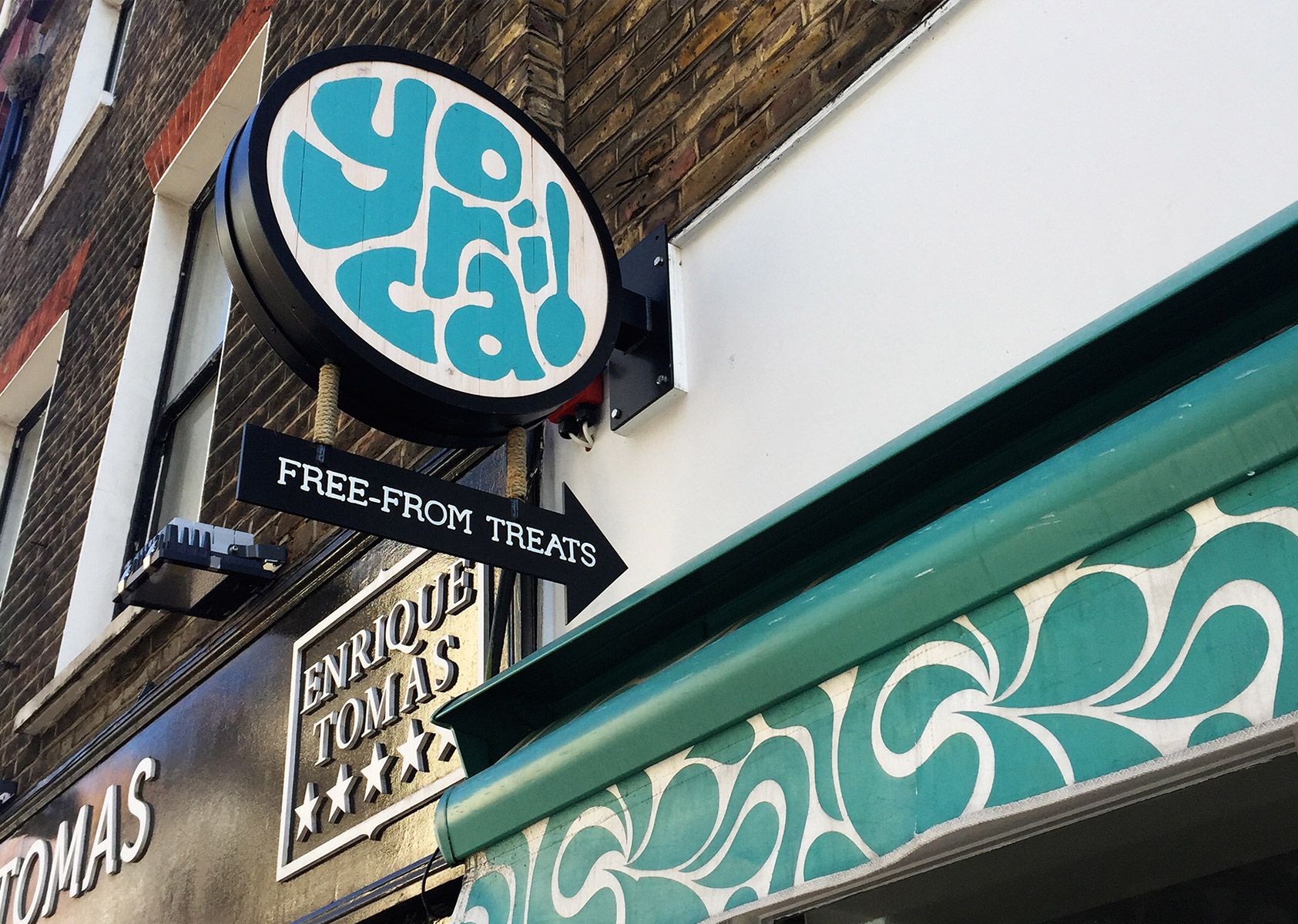
YORICA!
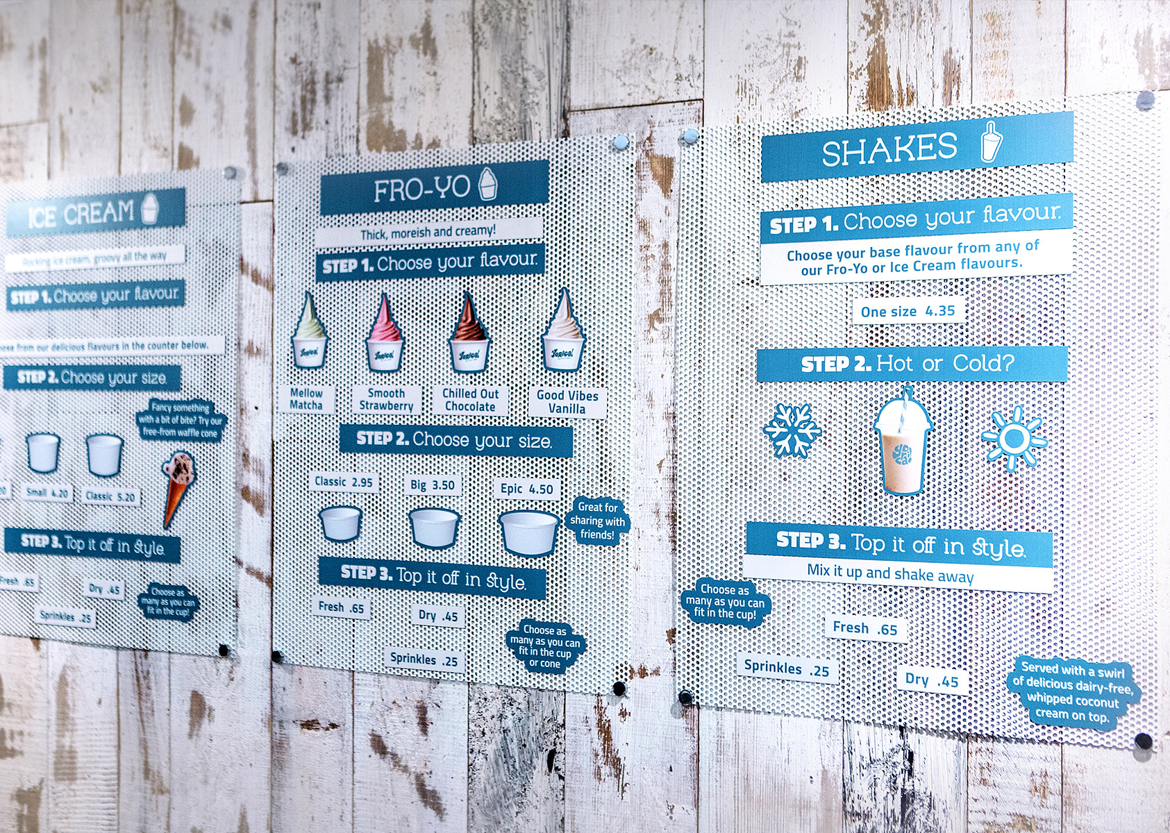
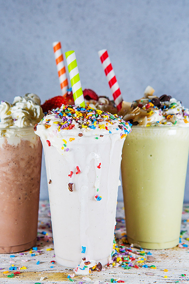
Yorica! is a new brand of deliciously natural, healthy and “free-from” treats, including ice creams, shakes and frozen yoghurts.
Owners, Monde Capital, hired Mystery to develop the initial concept into a scalable F&B brand, a free-from alternative to ice cream, fro-yo and shakes. The brand would start with an initial retail site in London's vibrant Soho, with a view to rolling out to other UK and international destinations.
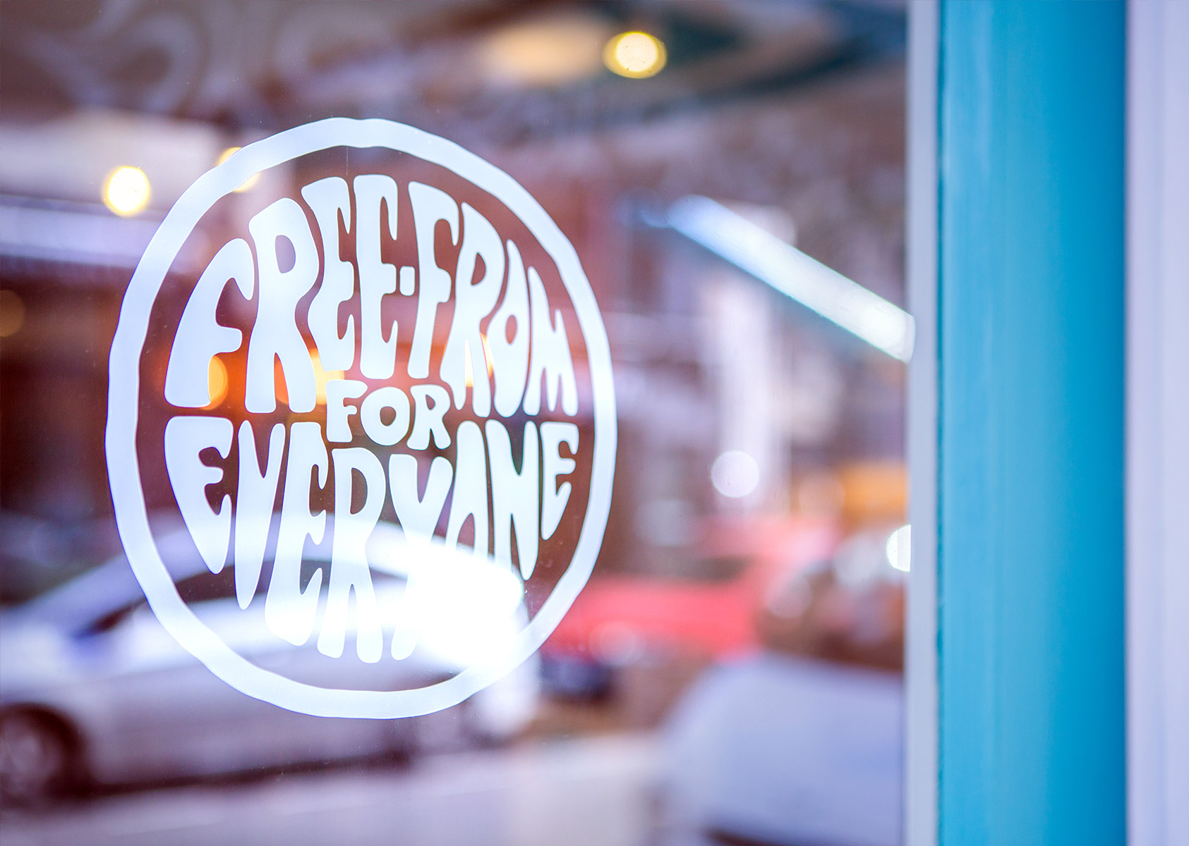
The concept is to allow everyone, even those with severe food allergies, the freedom to go out and enjoy treats like shakes, frozen yoghurts and ice creams with his family and friends.
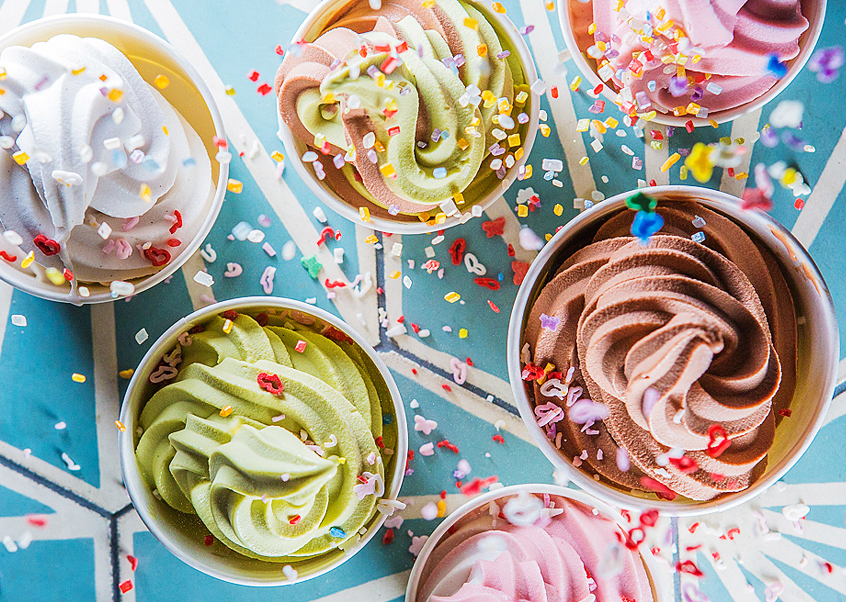
Dairy free, all Yorica products are made from plant-derived ingredients, such as sustainably-sourced coconut cream and carefully selected chocolate, Italian rice milk and seaweed.
All recipes and ingredients are free from wheat, gluten, dairy, eggs and nuts and all are entirely vegan, certified and traced, from crop to cone!
Strategy & Naming of Yorica!
The concept is all about providing a strong, easily recognisable and and scalable brand - a space and product – that gives people the freedom and confidence to indulge in amazing sweet treats, whether they suffer from intolerances or not.
Using our unique brand positioning process, Yorica was defined as a brand that had to convey a “movement”, a call to action, a sense of freedom, a fun and engaging concept that would provide a space where no matter the allergy, every treat choice was possible and the consumer can enjoy their own worry-free moment of pure indulgence and enjoy exactly the same experience as their friends or family.
The name Yorica was the result of brainstorm sessions with a focus on delivering a name that was one word and would be instantly recognisable and accessible to all nationalities, all ages and all walks of life.It had to convey a feeling of being altogether new, an epiphany of choice and availability.
With a focus on the core concept of Yoghurt, Rice, Coconut, YO-RI-CO took shape, blending together and evolving into its own “eureka moment” – YORICA!
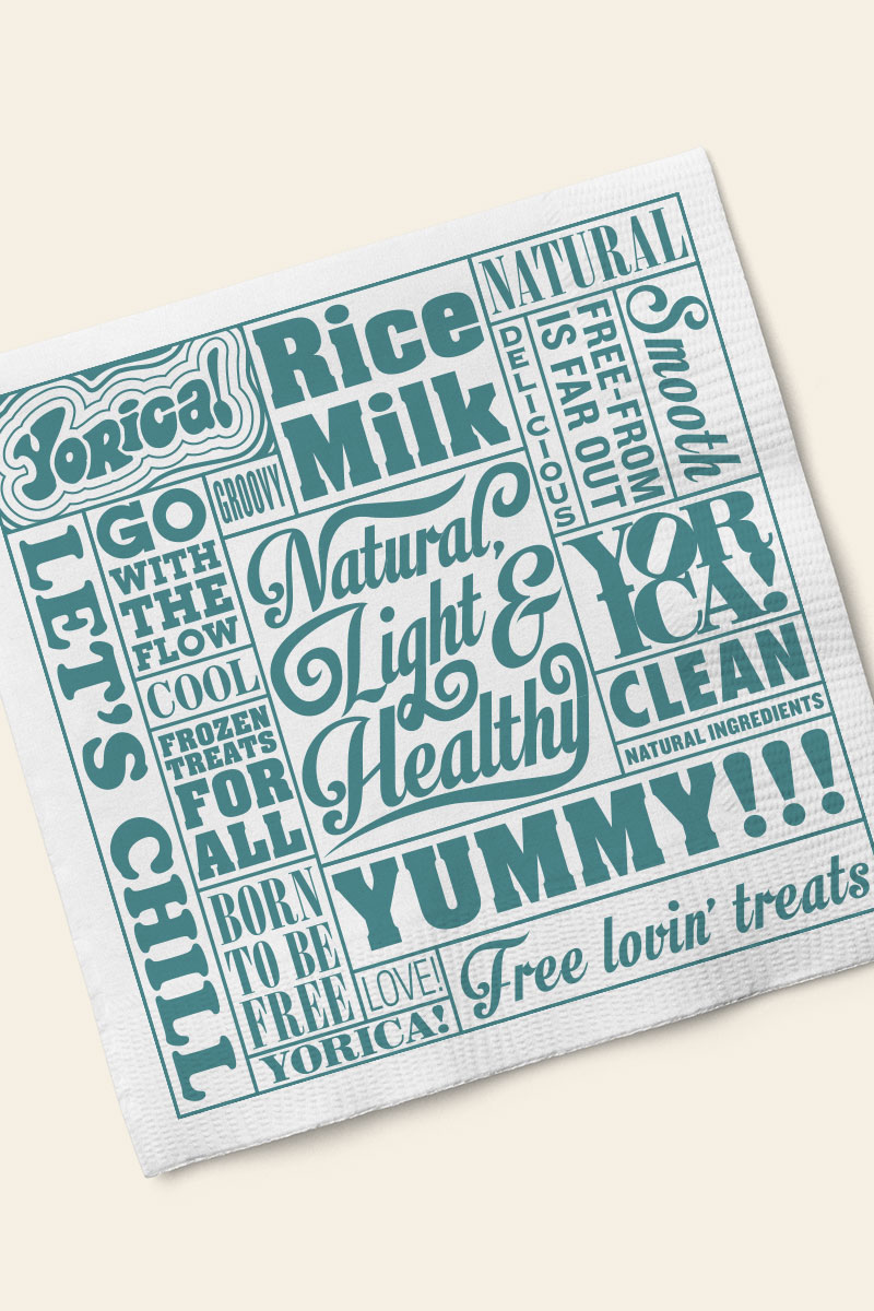
Brand identity and graphic design
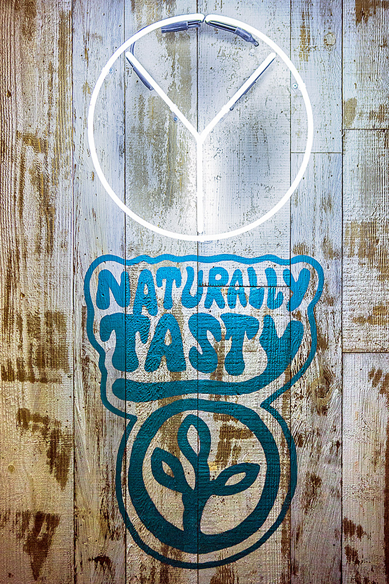
The brand ID is all about creating a freedom movement to inspire a revolution in the way people approach treats like ice cream, fro-yo and milk shakes. Yorica is a coming together of people with similar views and dietary limitations or choices, all looking for unrestrictive, sweet indulgence!
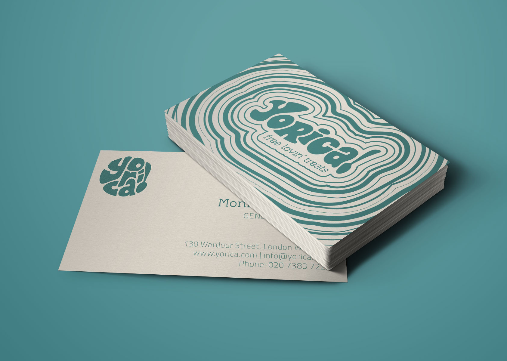
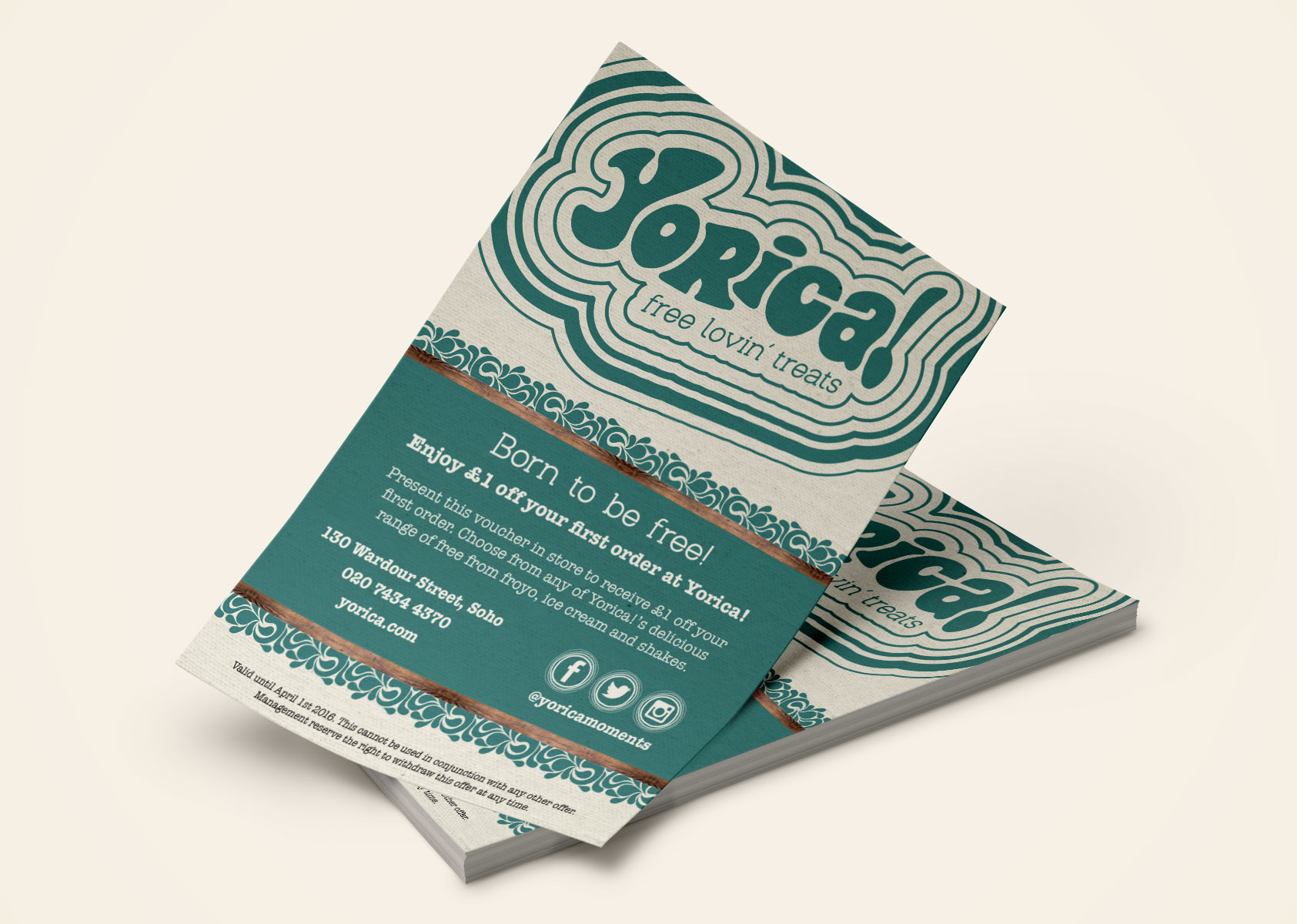
Brand ID was inspired by the “Yippie” movement – a youth-oriented and counter-cultural revolutionary offshoot of the 1960s anti-war/free speech movements, the branding is reminiscent of flower power and hippy graphics with the painted slogans of handmade signs from peaceful protests.
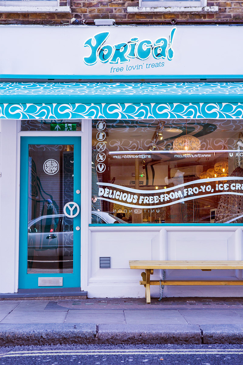
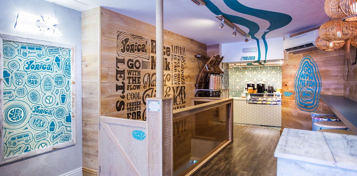
Interior Design
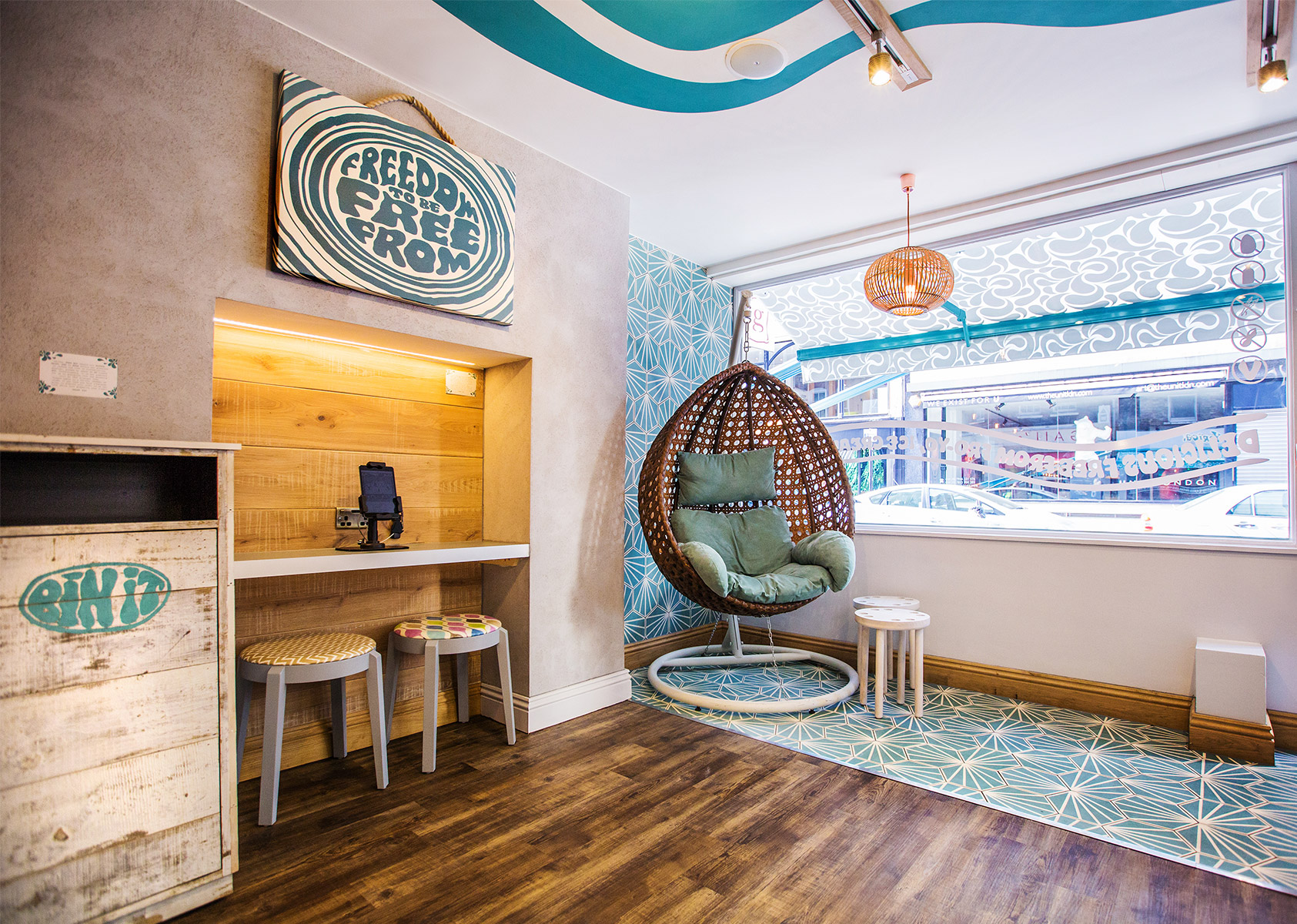
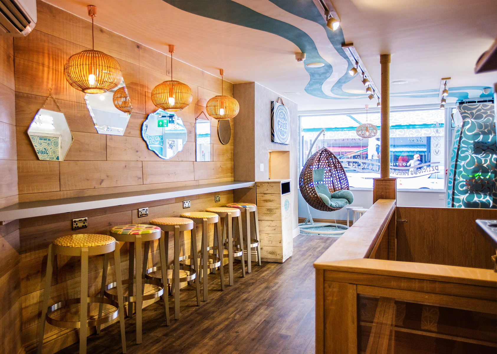
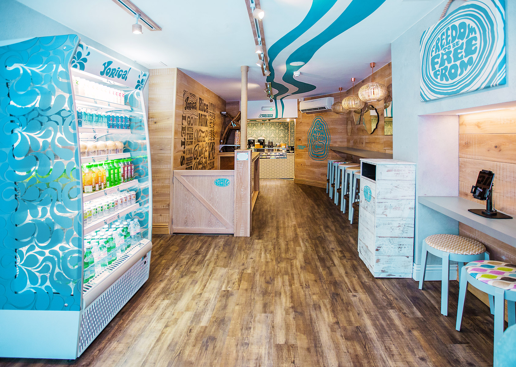
Inspiration for this scheme was taken from the swinging, free-lovin' 60’s era. The space was designed to be welcoming, approachable and warm in order to create an ‘everybody is welcome’ policy suitable for the free-from treats.
Our biggest challenge was ensuring all finishes and furnishings were completely cleanable, without letting in any allergens from the outside world. This involved a lot of research in finding alternative solutions to standard materials that were still in keeping with the look and feel of the space without being too clinical.
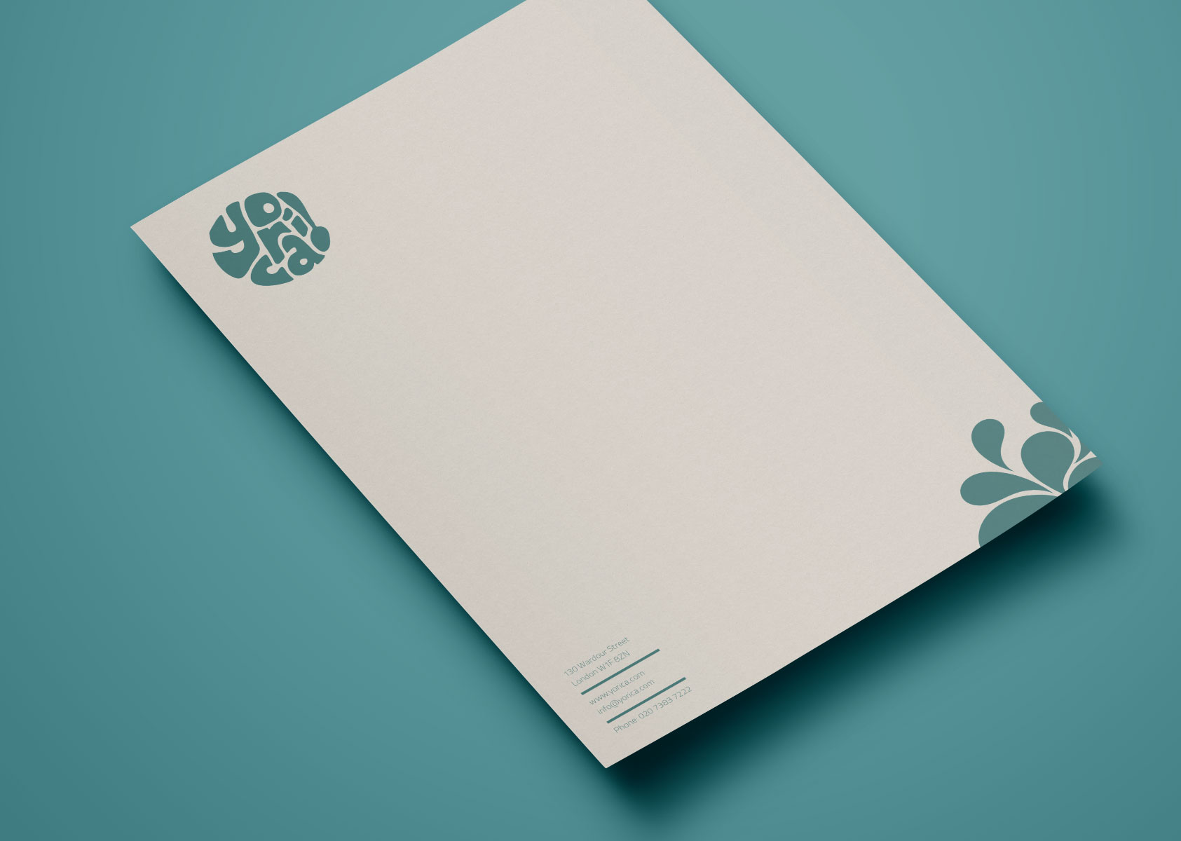
The main colour palette in the scheme consists of teal, copper and warm timbers, with materials chosen to work in conjunction with each other to create a warm and welcoming environment. The majority of Yorica’s competitors have very sparse, white environments. Our scheme was designed to allow Yorica to stand out in a crowded market and feel welcoming to those within and without intolerances.
The warm colour palette also helped to enhance and emphasise a very small space.
For many customers, this was the first time they could enjoy a delicious treat without worrying about their allergies, so the environment needed to reflect this and provide a welcoming, homely and comfortable space.
Instagrammable #yoricamoments
This scheme was created to be incredibly social media friendly. In order to make the space photo-friendly, without being gimmicky or brash, a few key elements were introduced:
- A customised hanging chair in the window to draw attention from the outside (this has been a proven Instagram success!)
- A ‘selfie wall’ with branded ‘Yorica Moments’ neon above a Yorica style frame to encourage customers to take and share photographs within the space
- Stand-out tiles in key locations create interesting visuals with in the store as backdrops and design elements
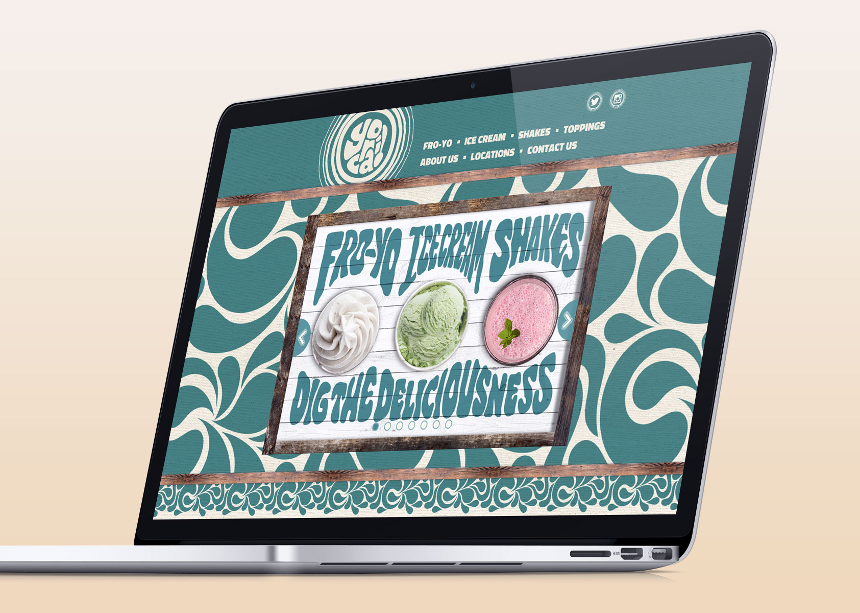
Yorica! Website design
Using the same look and feel of the graphic design, the website would be live before the launch of the actual site and therefore the first point of direct contact with consumers.
Its aim was to create a strong online brand personality that set the stage for the launch of this exciting new concept, enabling the brand to grow both excitement and anticipation for the launch (also through links to Yorica’s social media), as well as a database of interested potential customers.
While the site had to tell the Yorica story and showcase the produce range, it also had to educate the visitor with information detailing the product ingredients, as well as building hype for and providing information on how to find the first high street location.
The challenge was in balancing the required photographic visual direction with a solution that would load quickly and be responsive for mobile devices.
The Yorica Wardour Street store opened to great excitement, with the first weekend seeing queues down the street. This unique, fun, free-from concept is already proving a huge success, boding well for its plans to expand to further locations.
“Mystery have proved to be excellent from start to finish. They are like a 'one stop shop': They came up with the brand name, the look and feel, the design and were there when we went on site. They took our brief, created our new brand and have contributed to the instant success of the shop.
Their approach was very well thought through and presented in such a way that it was easy for us to follow. Their step by step process ensured we achieved our goals on time and on budget. The results are there for all to see. When we need to create another brand we will go to Mystery for their services.”
Charles Prew, Monde Capital