Savoursmiths
A better breed of crisp
Fourth generation potato farmers, Savoursmiths’ founders, Mike and Colette were looking to diversify the family’s farming business. Tired of snacks with the same old flavours, they decided to innovate and produce their own lavishly flavoured, healthier snacks from their farm’s own produce, to create a brand of crisps that combines convenience with superior quality and taste.
Mike and Colette approached Mystery to help them design the product and bring their idea to life, including naming, brand identity, pack design and copy for their new crisp venture.
Brand Positioning
Through our unique brand positioning process, we defined Savoursmiths as being a combination of the Lover and the Rebel: A Romantic Radical, with a core value of audacious luxury – showing a willingness to take surprisingly bold risks, while being the epitome of excellence and desirability.
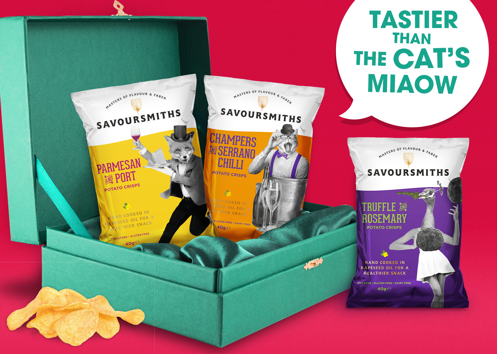
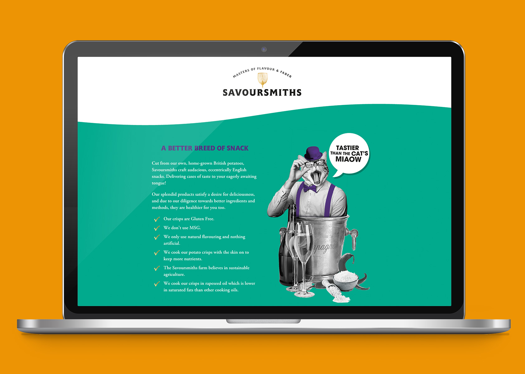
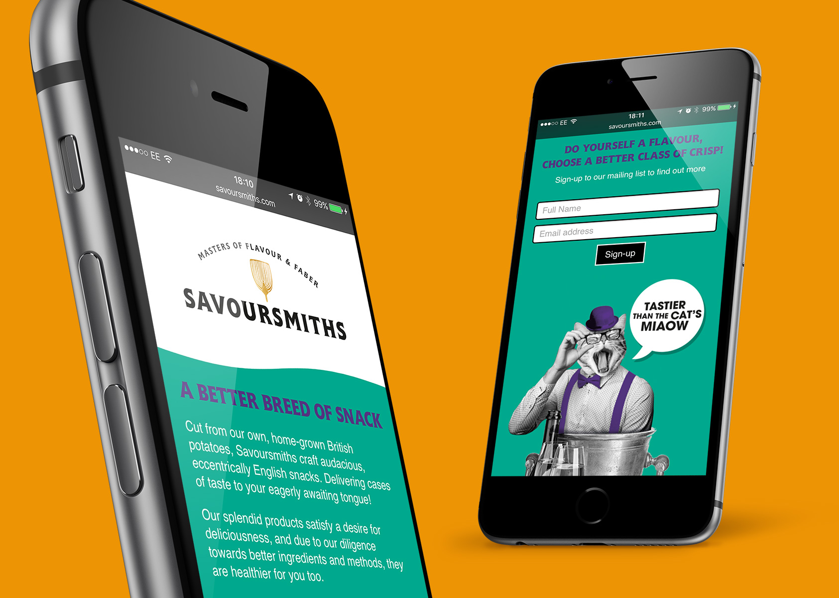
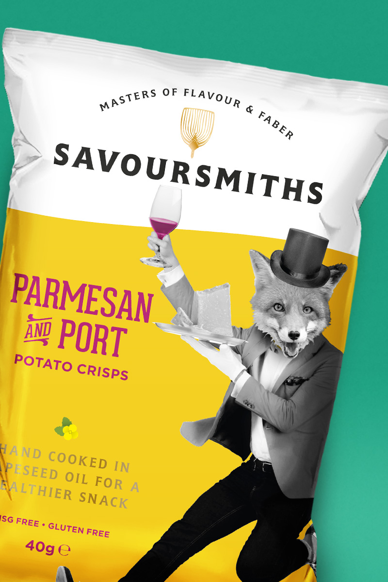
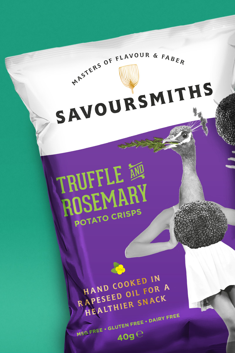
Cut from their own, home-grown British potatoes, cooked in their skins in the farm’s own rapeseed oil, these crisps are not only tastier, better looking and higher quality than your average crisp, but they're healthier too. Gluten free with no MSG, they use only natural flavourings and contain nothing artificial.
Naming
With Mike and Colette as the definitive ambassadors for the brand, the couple were open to exploring naming options. Following a workshop, the decision was made to incorporate the family’s heritage and family name 'Smith' into the new brand’s title.
With the brand personality and superior taste and quality of the crisps in mind the 'Savoursmiths' were born – makers of fine potato crisps who source the most luxurious ingredients and enjoy the satisfying crunch and sophisticated flavours in true, old school, British style.
Brand Identity
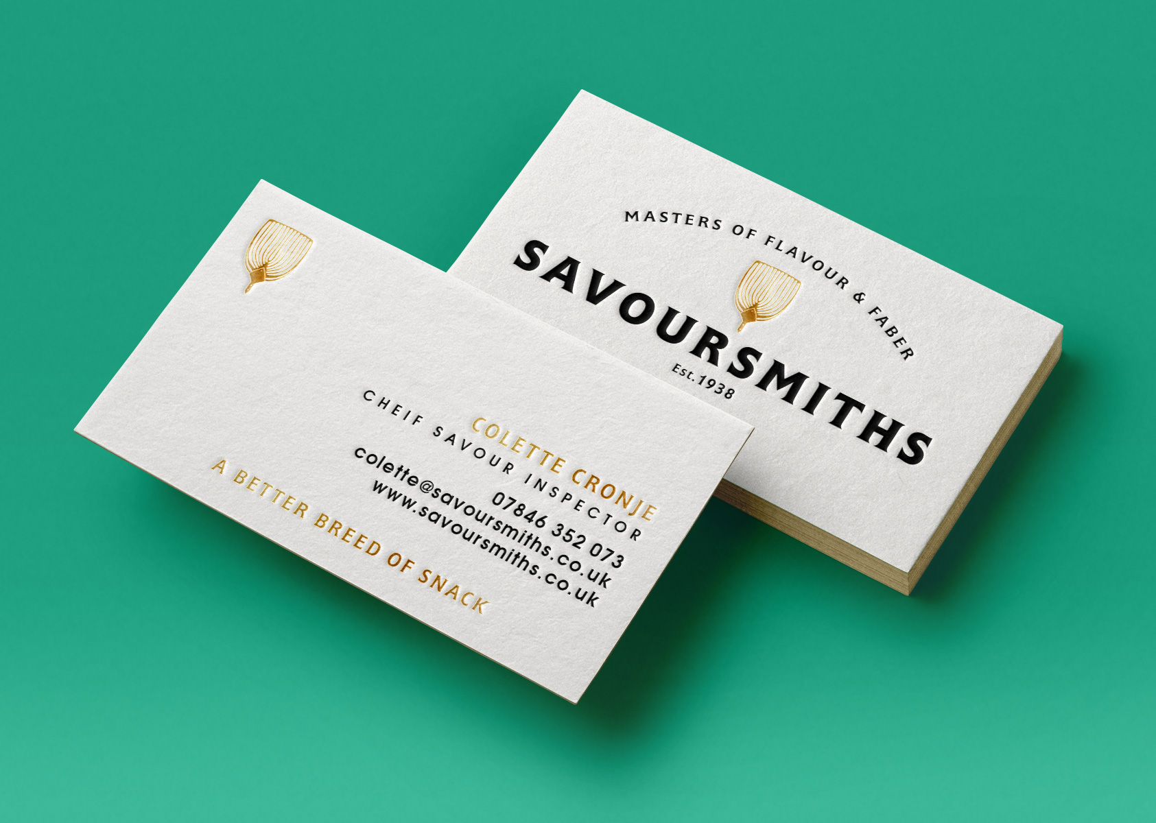
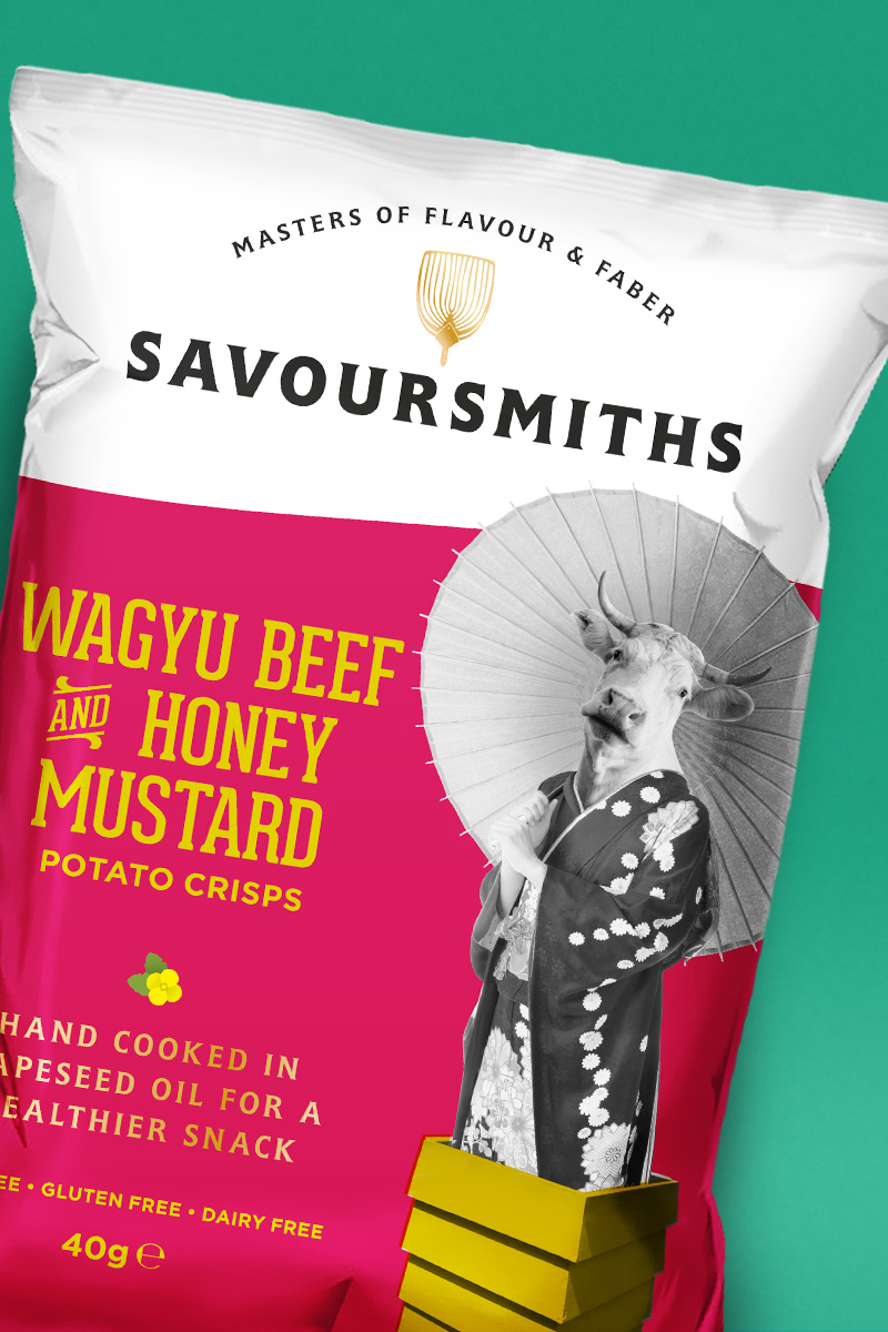
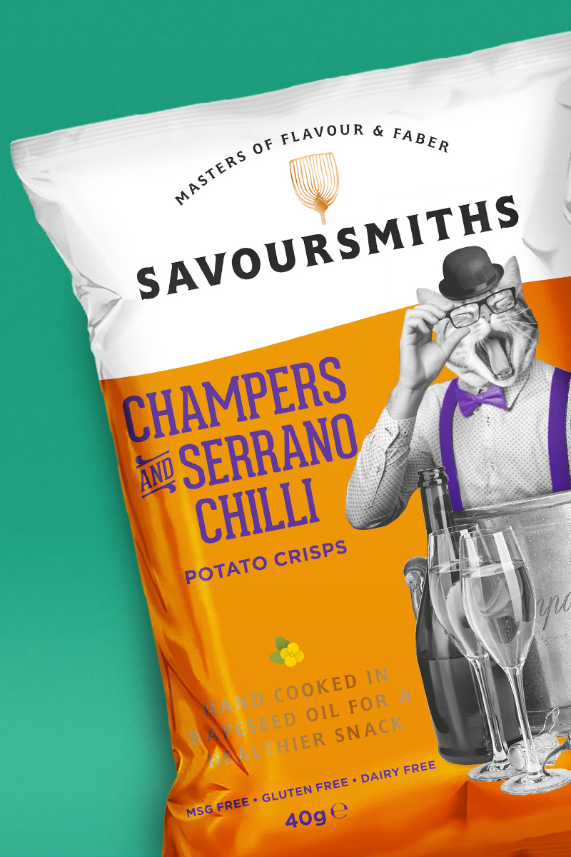
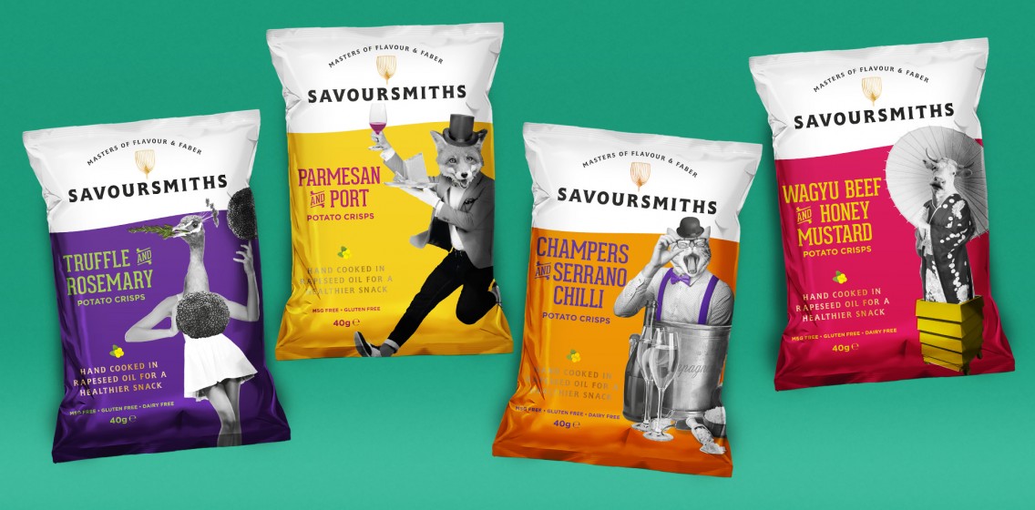
The logo design takes inspiration from luxury fashion brands – polished and distinguished, with hints to the unique heritage of the family’s farm. The Savoursmiths take a potato spade – a vintage tool historically used in potato farming – as the golden emblem in the middle of their logo, hinting at the hand-cooked methods and artisanal qualities of the business.
Packaging design
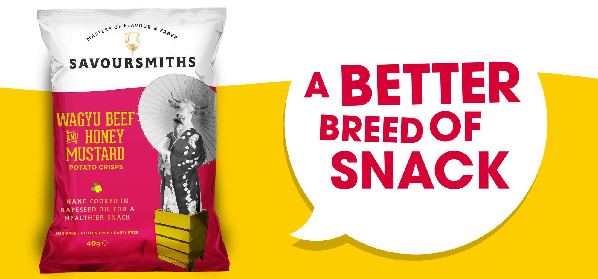
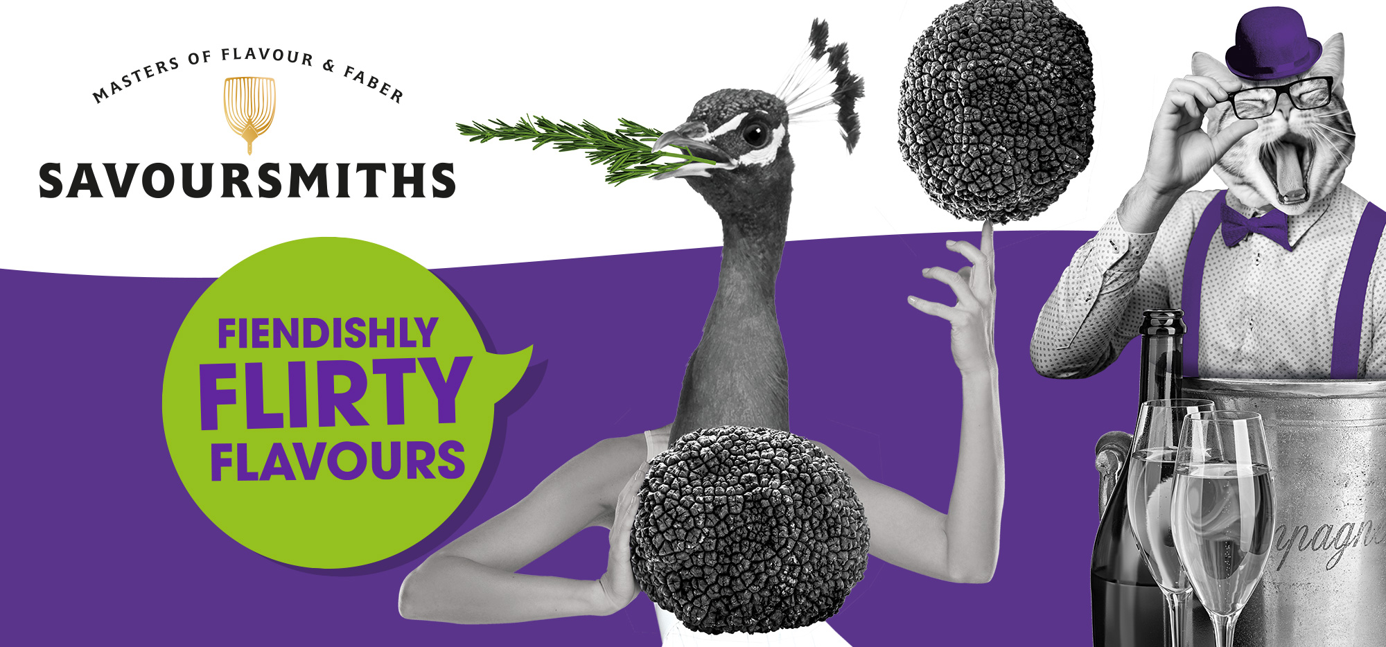
Creating a cast of crafty characters to feature on the fronts of the wildly colourful, metallic packets, the packaging reflects the brand’s upmarket values and spontaneous eccentricity. With a knowledgeable and energetic tone of voice, the pack designs incorporate tailor-made copy, written in house by the studio to help convey the brand’s expertise and wit!
As part of the design brief, Mystery also created business cards and the exhibition stand design for the brand’s stands at Olympia’s Speciality Foods Fair and Lunch! Food fair and advised the Savoursmiths team on suitably stylish attire to help create a memorable experience in a busy exhibition space.
Mystery has been great in helping us bring SAVOURSMITHS to life. The team was energetic, positive, humorous and fun, with exceptional creativity and inspiring ideas.
Colette Cronje, Savour Director
The brand has already been snapped up by prestigious fine foods retailer, Fortnum & Mason with plenty more retailers chomping at the bit.