Nana Nice Cream
The banana-based dairy free ice cream alternative
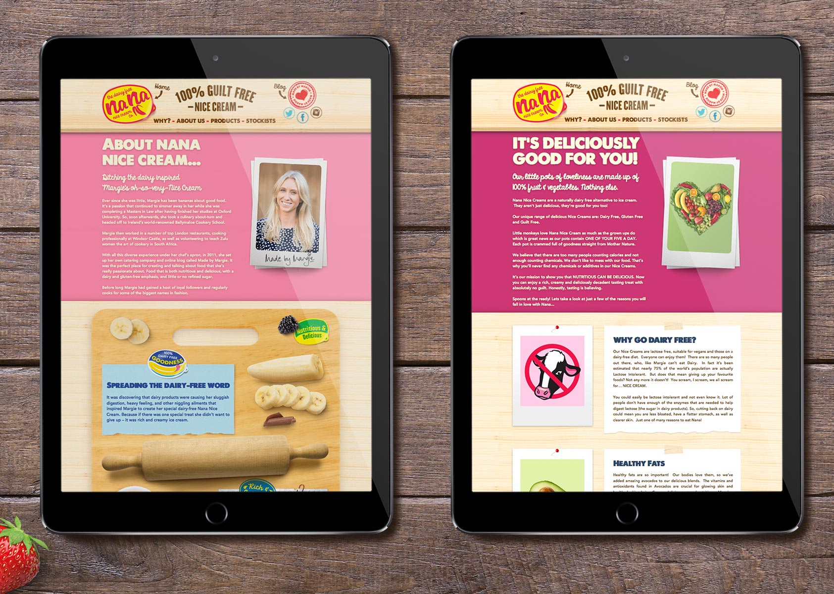
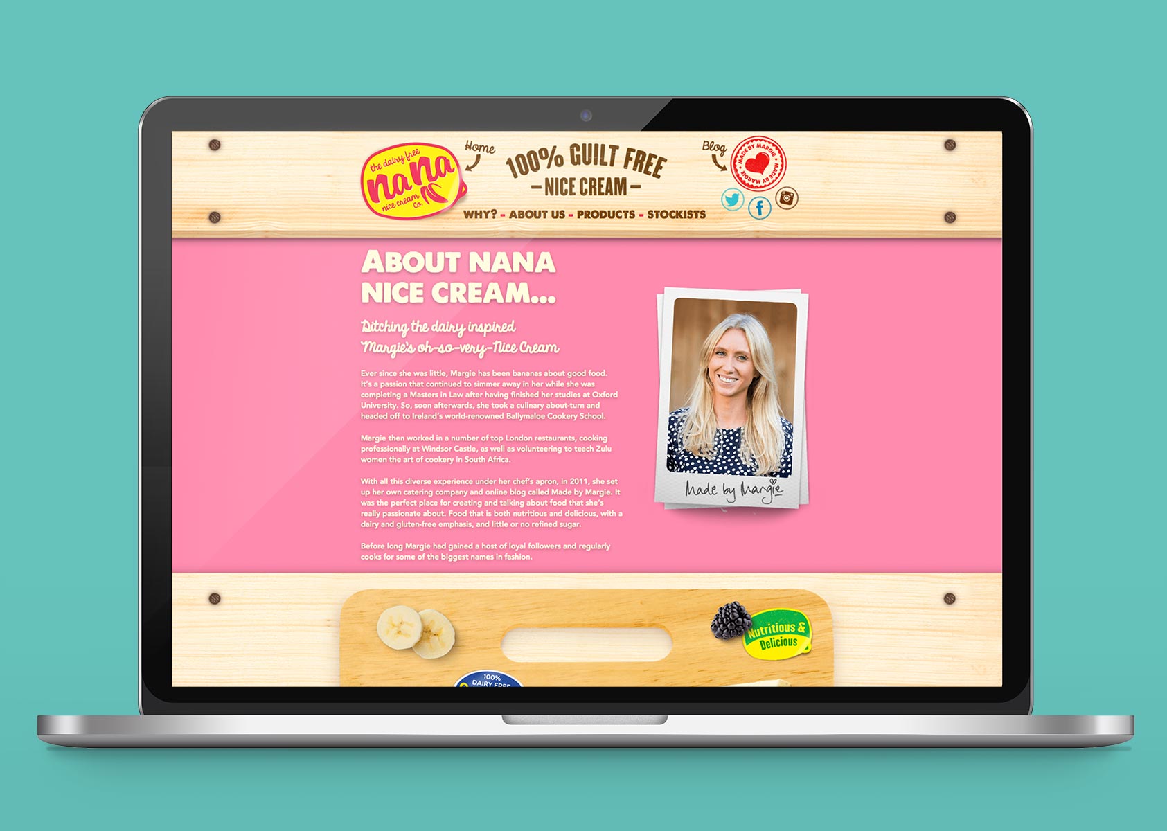
Ice cream fanatic, professional chef and food blogger, Margie Broadhead (of the Made By Margie blog) approached Mystery to help her bring to life her dream of her own brand of deliciously nutritious dairy-free, gluten-free, guilt-free ice cream alternative.
The concept was borne from her own lactose intolerance and a desire to create a non-dairy, healthy substitute to satisfy her ice cream cravings. The result was a unique wholly natural, banana-based, 100% fruit and vegetable, dairy-free ice cream alternative that’s as deliciously nutritious as it is simple.
The Mystery team was tasked with developing the brand strategy and vision for Nana Nice Cream, creating the name and brand identity, designing the original packaging and building a simple, yet effective and engaging website that would tell Nana’s unique story and educate customers about the product and the idea of nice ice cream.
Strategic Brand Positioning and Naming of Nana
Our unique brand positioning and vision methodology defined the following values:
Assured - consistent, confident, positive and relevant Natural - provenance, healthy, credible, simple and honest Approachable - warm, welcoming, open, friendly and sociable Healthy - dynamic, energetic, "on the go" Outspoken – clear about issues such as obesity, additives and refine sugars; confident but not arrogant Idealistic – a desire to create a new vision for healthy, nutritious snacks that are delicious with the drive and the passion to deliver it Energetic with a sense of fun, happy, proactive, fit, agile and lean Playful - fun loving and not stuffy, distinctive and bold
We defined the core values of Nana to be fun, guilt-free, healthy, outgoing and assured. A new health-focused product that was relevant in a world where consumers are looking for alternatives designed to manage common allergies and intolerances. Nana Nice Cream is delicious AND healthy and it’s out to prove it.
Being dairy free, good for you and a rewarding alternative to dairy ice cream helped create “Nana Nice Cream”: “Nana” being short for Banana and Nice because it’s healthy, allergen free and not dairy ice cream! It’s NOT Ice Cream, it’s Nice Cream! In fact, it’s the nicest nice cream you’ll ever taste.
Nana Nice Cream delivers a fresh, fun, fruity and deliciously tasty dairy-free, gluten free ice cream alternative, with no additives or refined sugars.
Nana N-Inspiration for brand identity
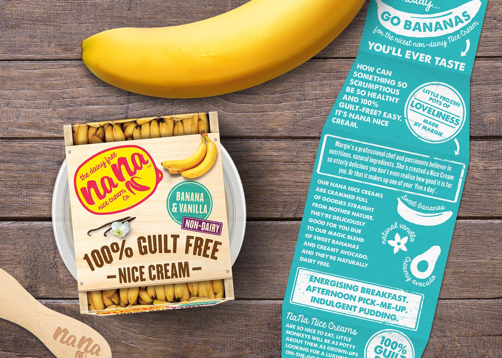
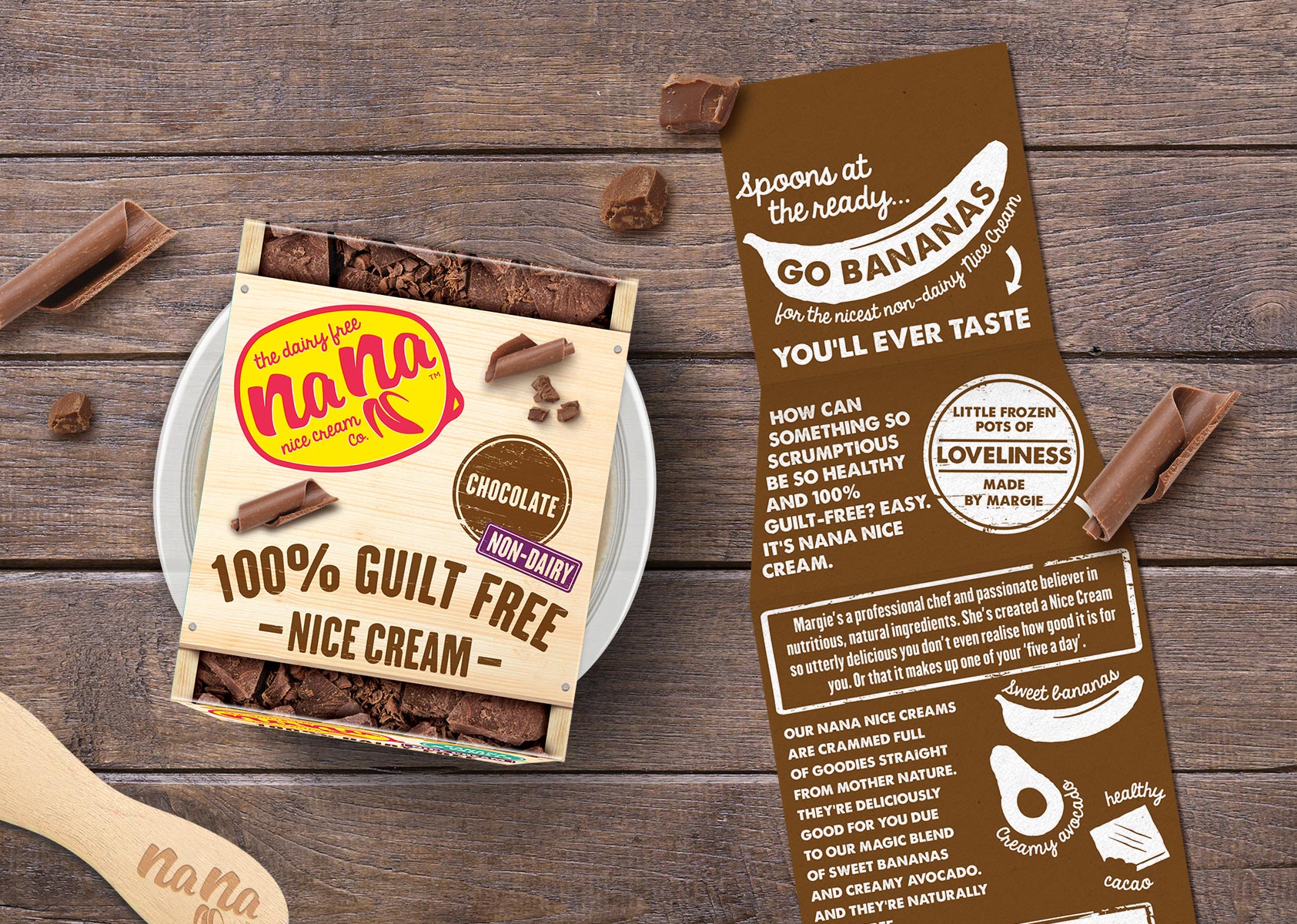
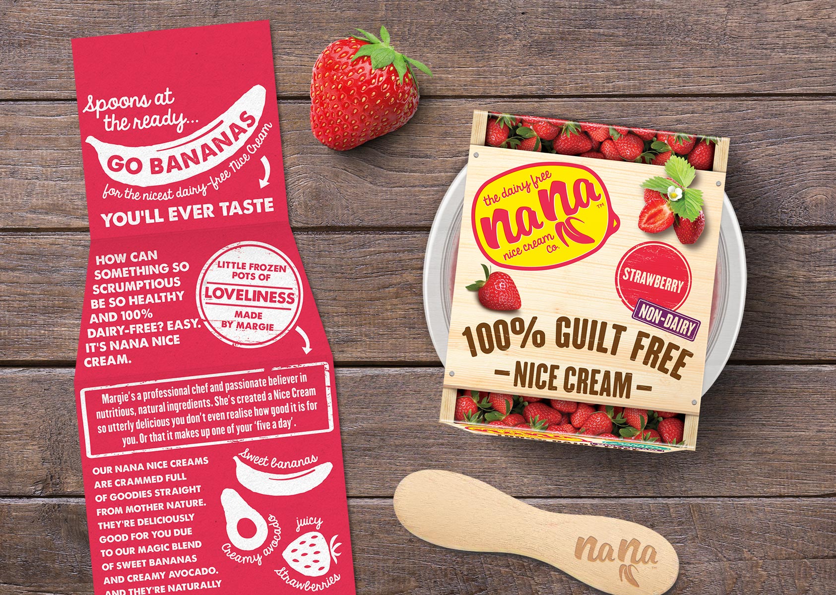
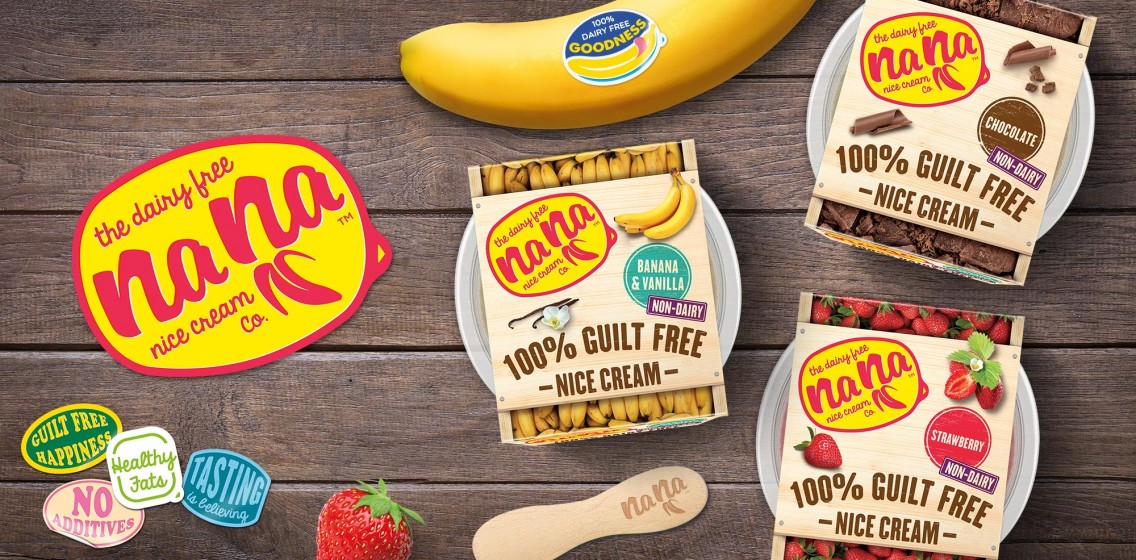
Creative inspiration for the logo and brand identity came from the retro style banana stickers and crates from the 1950s – they represent wholesome, fruity goodness before over-packaging and cellophane wraps.
We designed the Nana logo as a retro banana sticker, incorporating a little banana design motif into the name. This logo appears on all packaging and throughout the website.
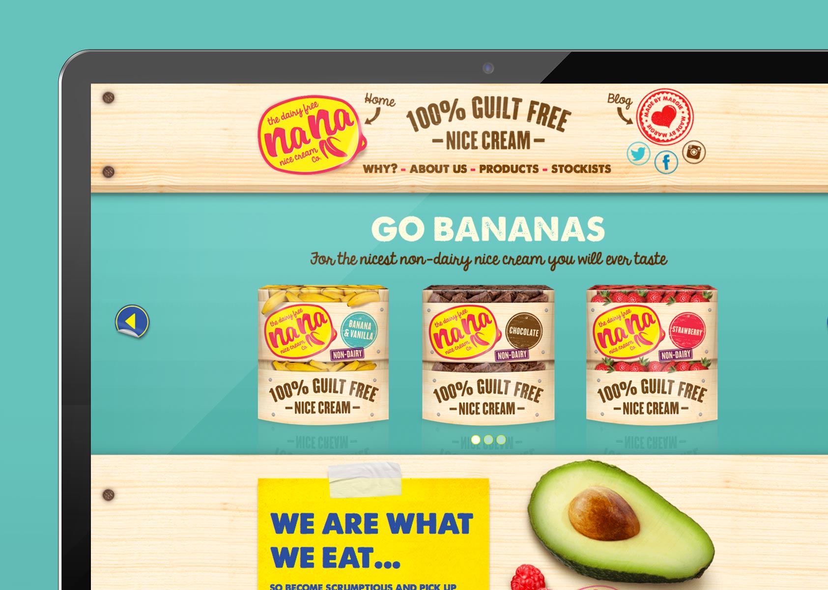
Food Packaging Design: Overcoming spatial challenges
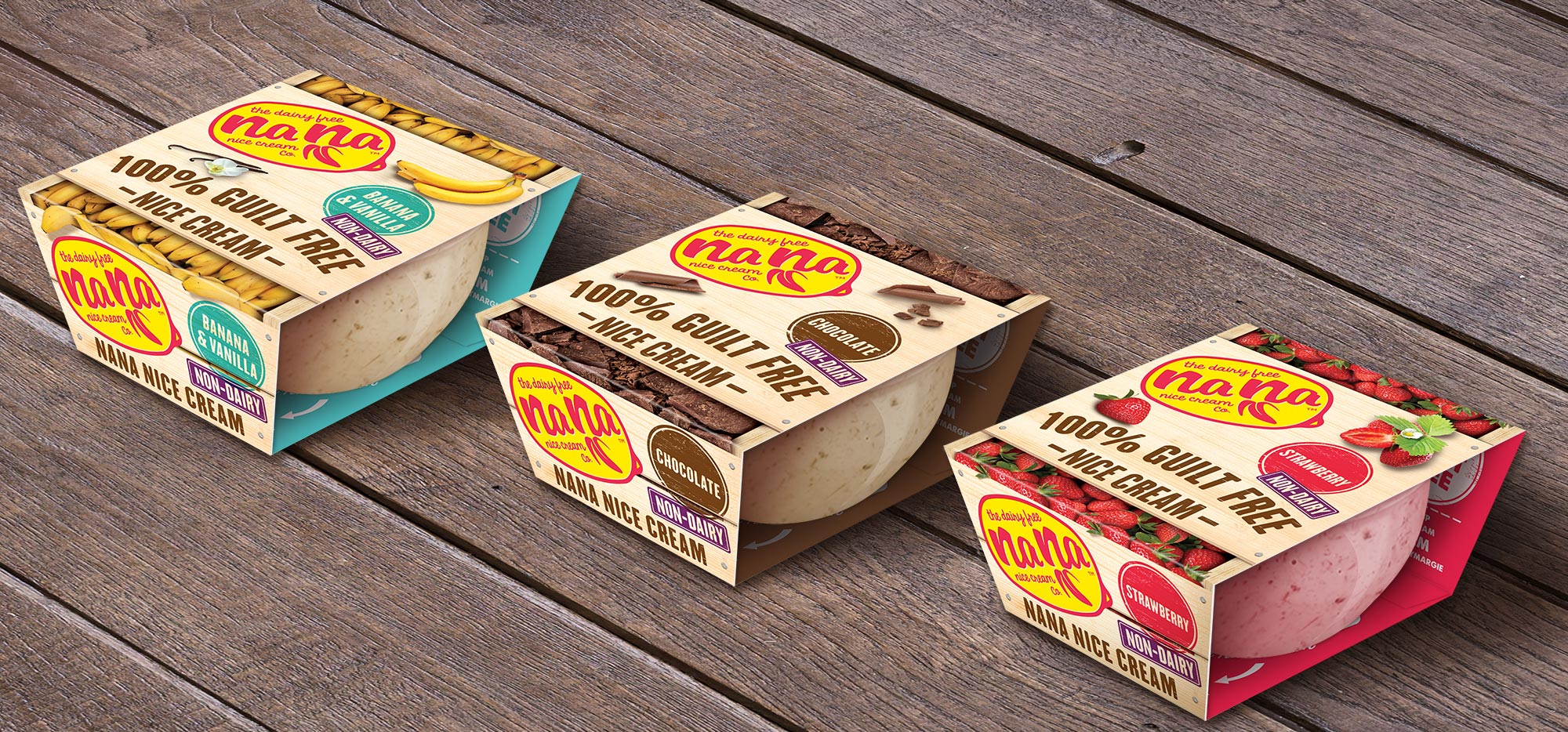
As well as brand identity and website creation, Mystery designed the packaging and labeling. Continuing the theme of the retro banana box, we developed a contemporary take on the banana box in miniature: Square as opposed to the traditional round tub, in order to give flexibility in the freezer aisle; brightly coloured, fun and engaging to give it the edge over traditional ice creams.
Food labelling is challenging at the best of times and with new regulations for minimum font size on food labelling and a change of packaging size required for a change in contents size, some additional spatial challenges had to be overcome.
All packaging and labelling information needed to fit on a small outer. And due to potential placing in chest or upright freezers, the label information also had to be the same on the top as on the side of the tubs and all print work had to be suitable for printing onto freezer/condensation-proof card.
We love solving problems at Mystery, so with tenacity and creativity we overcame the issues and created a refreshing, youthful and contemporary, yet retro design that is as unique and individual as the product and its creator and that helped make Margie’s dream a reality.
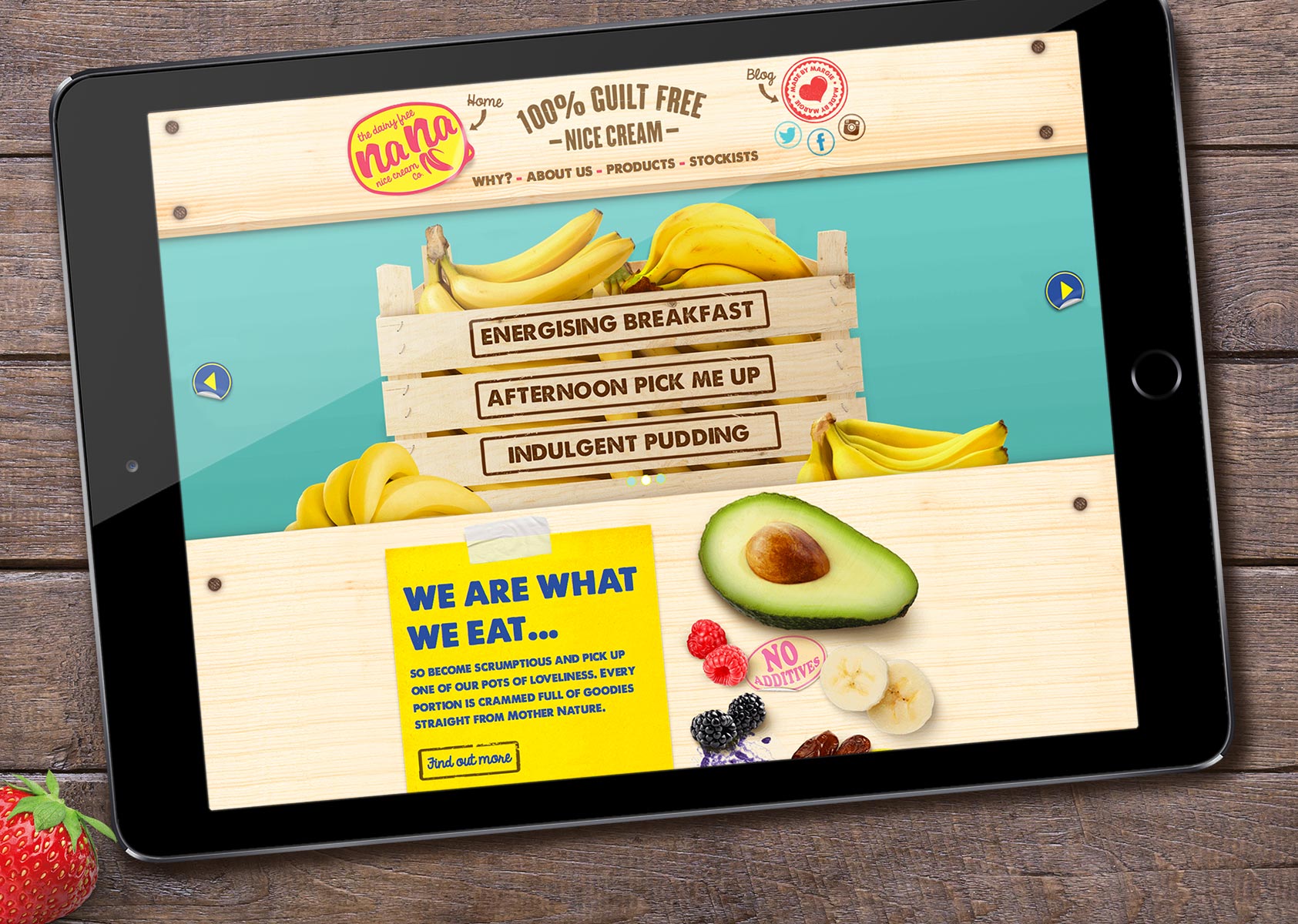
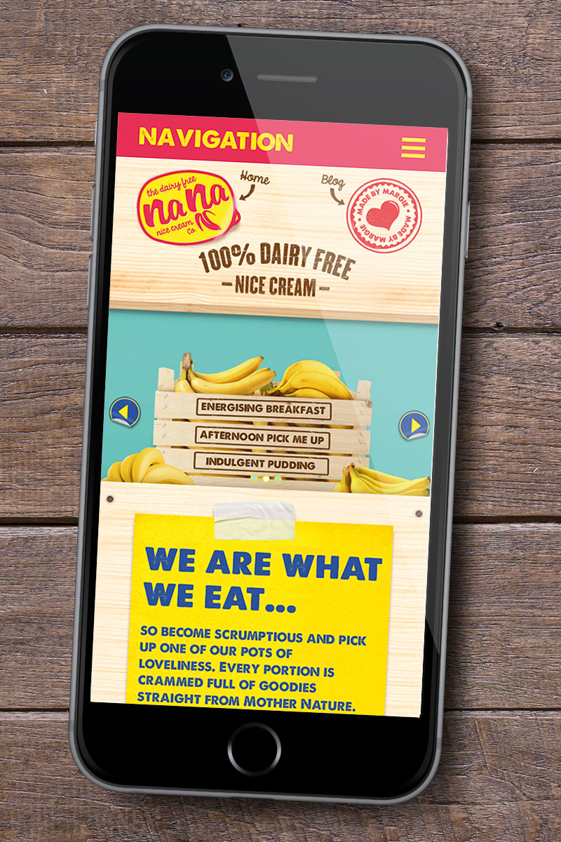
Wholesome simplicity for Nana Nice Cream website design
With simplicity and wholesomeness at its core, the website delivers all the key brand messages, using the same brightly coloured, banana driven creative style as the packaging design, set on a background of banana crate wood effect.
The website’s function is easy to use and navigate – an effective and engaging info site that gives potential customers, retailers and Nana Nice Cream fans alike all the information they need to get to know the brand, whose behind the idea, its personality, ingredients and variants and most importantly, to find out where to get it.
Nana Nice Cream is now ready to go out there and conquer the world, one tub at a time.