SLOANE BROS.
Purveyors of fine frozen delights
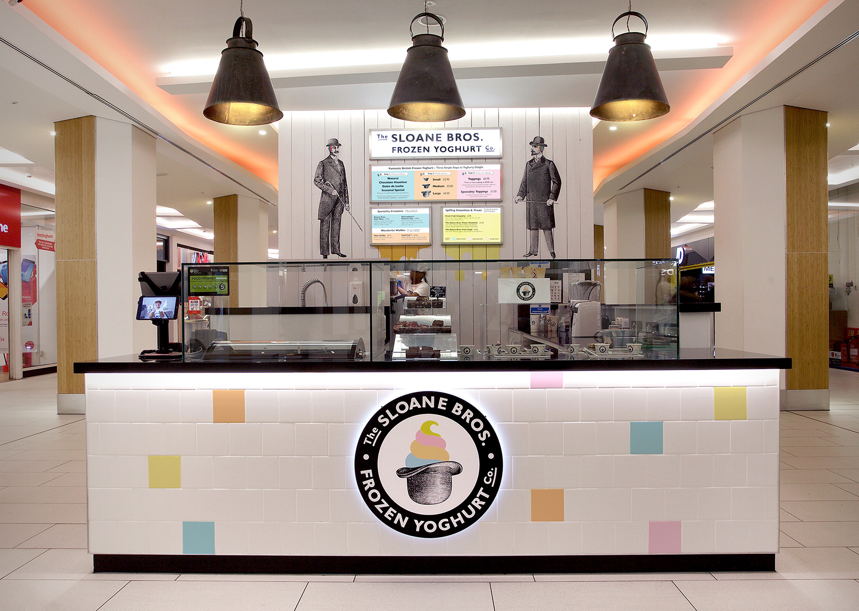
Having worked with Sloane Bros Frozen Yoghurt Company on the brand’s initial positioning, naming, identity design and website, Mystery was engaged to help Sloane Bros with the next stage in its story - a roll out program of kiosks for major mall sites around the UK, starting with the INTU Victoria Centre in Nottingham.
Sloane Bros’ identity was designed to reflect the historic, very British character of the site in one of London’s best known restaurant districts, while appealing to a broad customer base, including families, local residents, young city professionals and tourists alike.
Joseph Firas Chakra, Private & Venture Investor, Strategic Consultant at Lancer Capital Limited, wanted his new delicious, healthier and lower fat frozen yoghurt to stand out from other often ‘clinical’ frozen yoghurt brands.
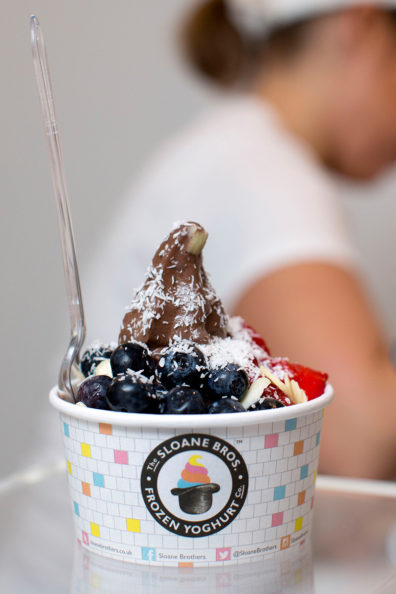
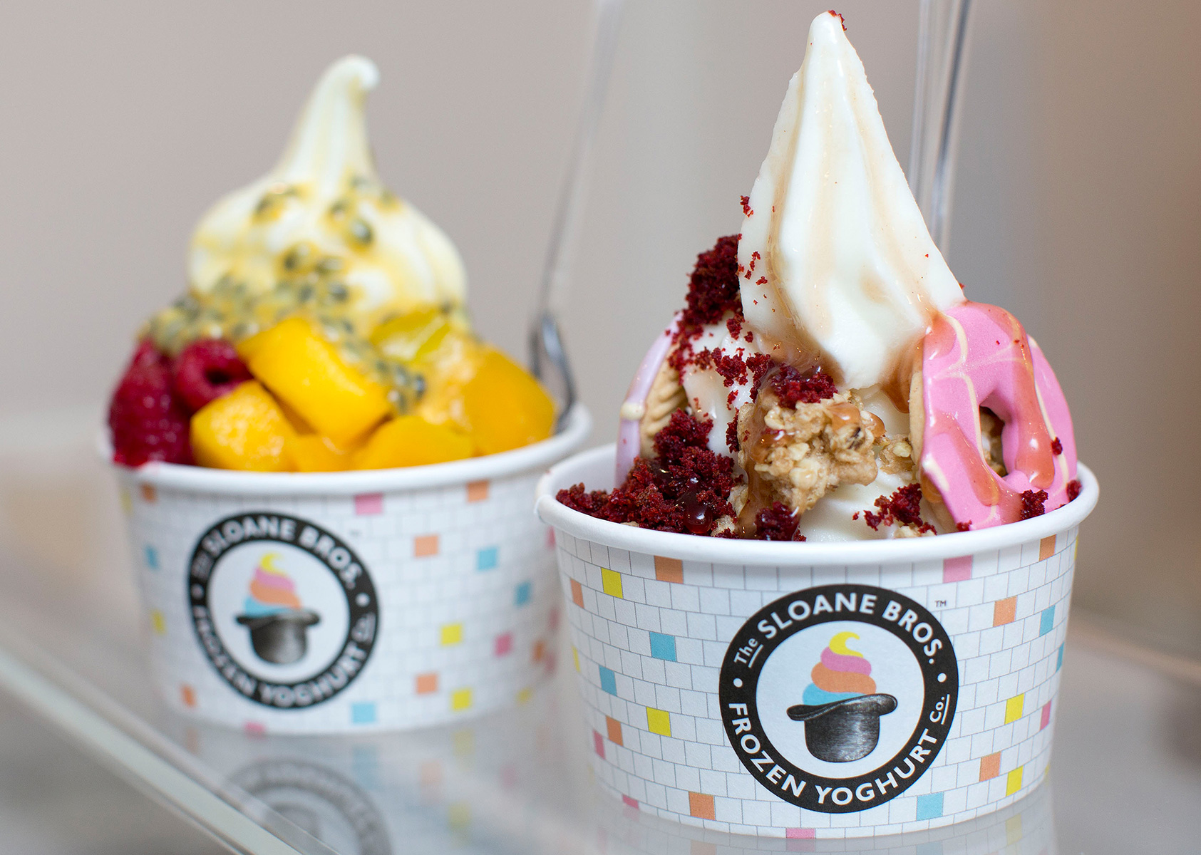
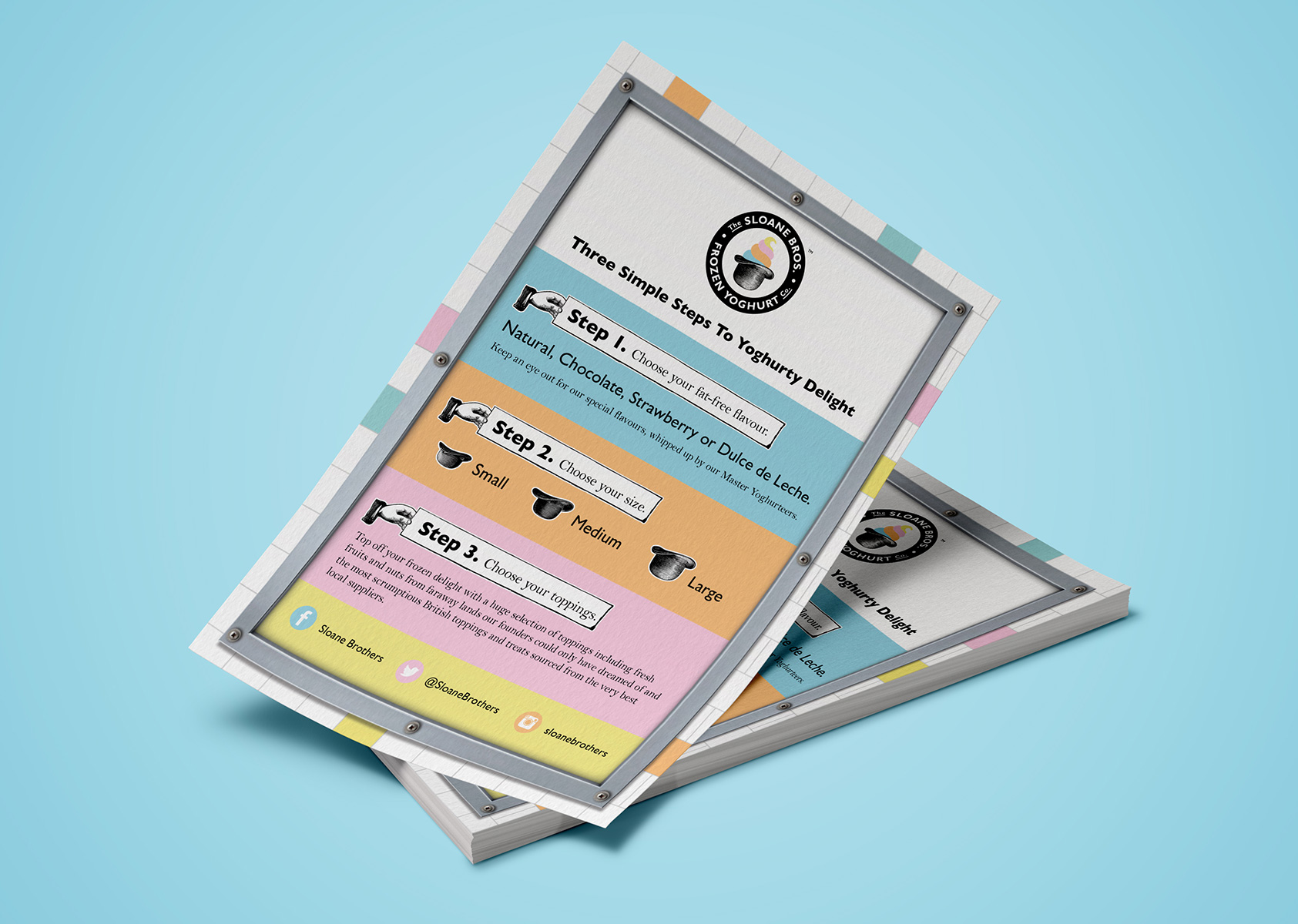
With very British flavours and toppings, including custard creams, pink wafers, brownies and Fox’s Party Rings, Sloane Bros provides a colourful, fun and unusually traditional take on the present-day fro-yo phenomenon.
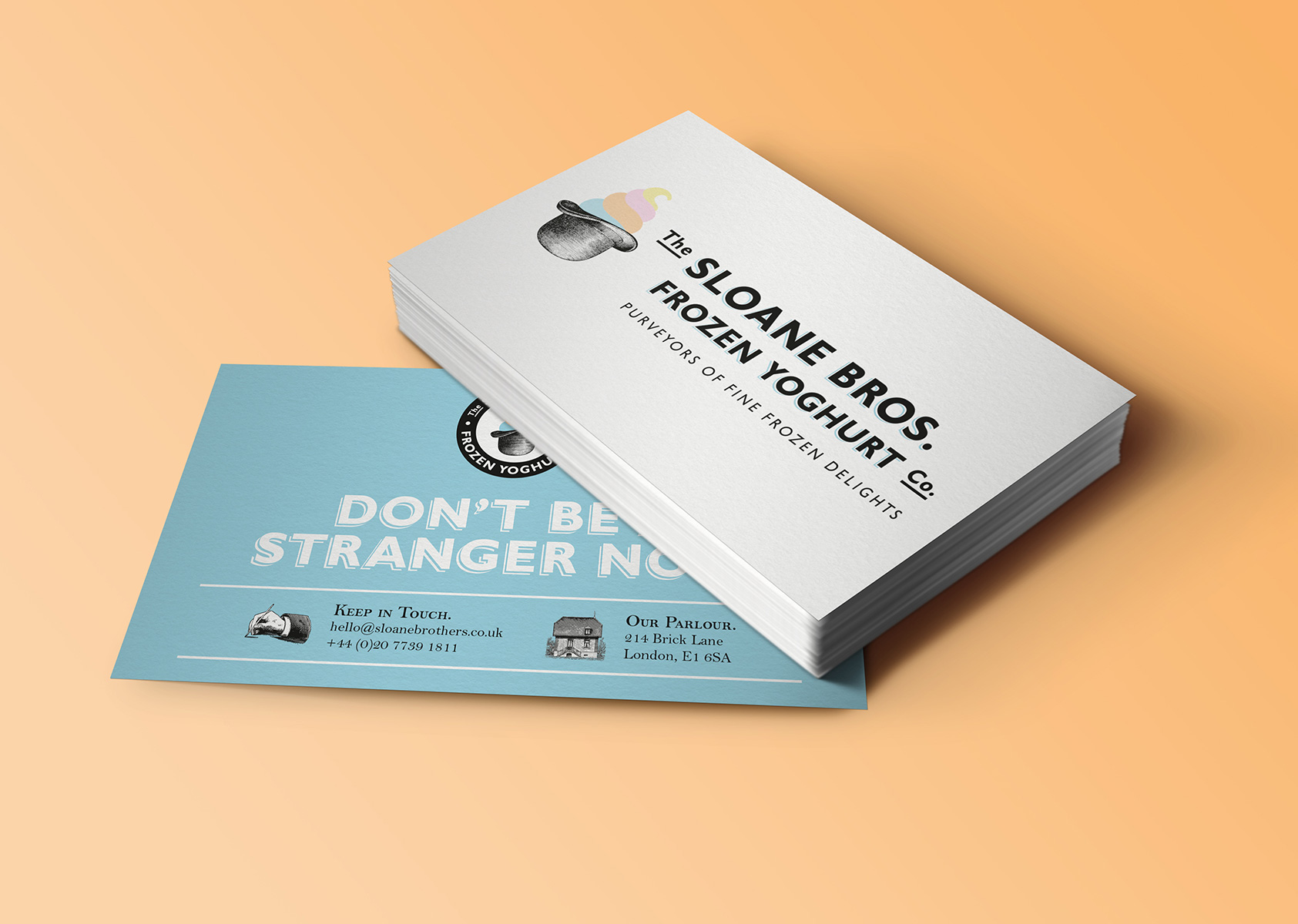
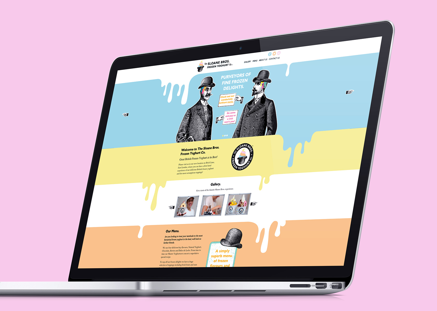
In keeping with the Brick Lane site and brand character, Mystery created the name, branding, identity graphics and language to convey a very British character that engages the customer through personality and humour via an intriguing backstory, memorable characters, graphics and quirky messaging.
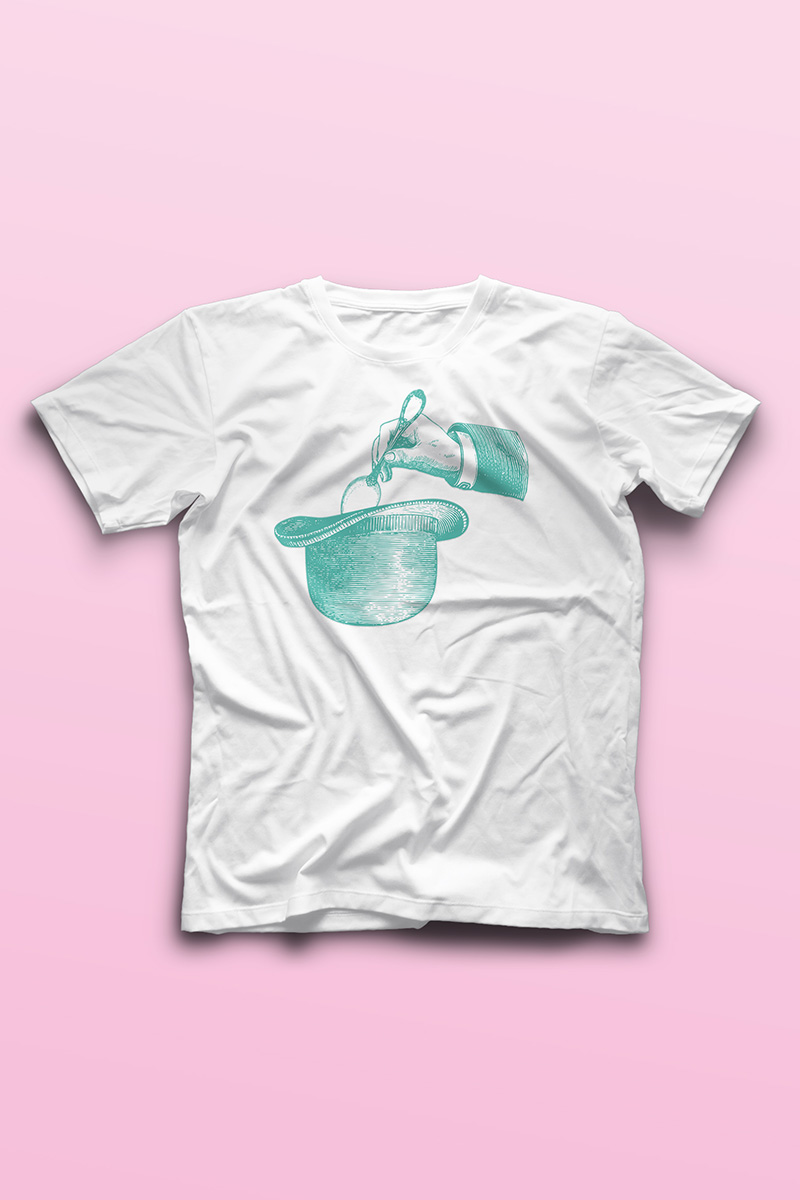
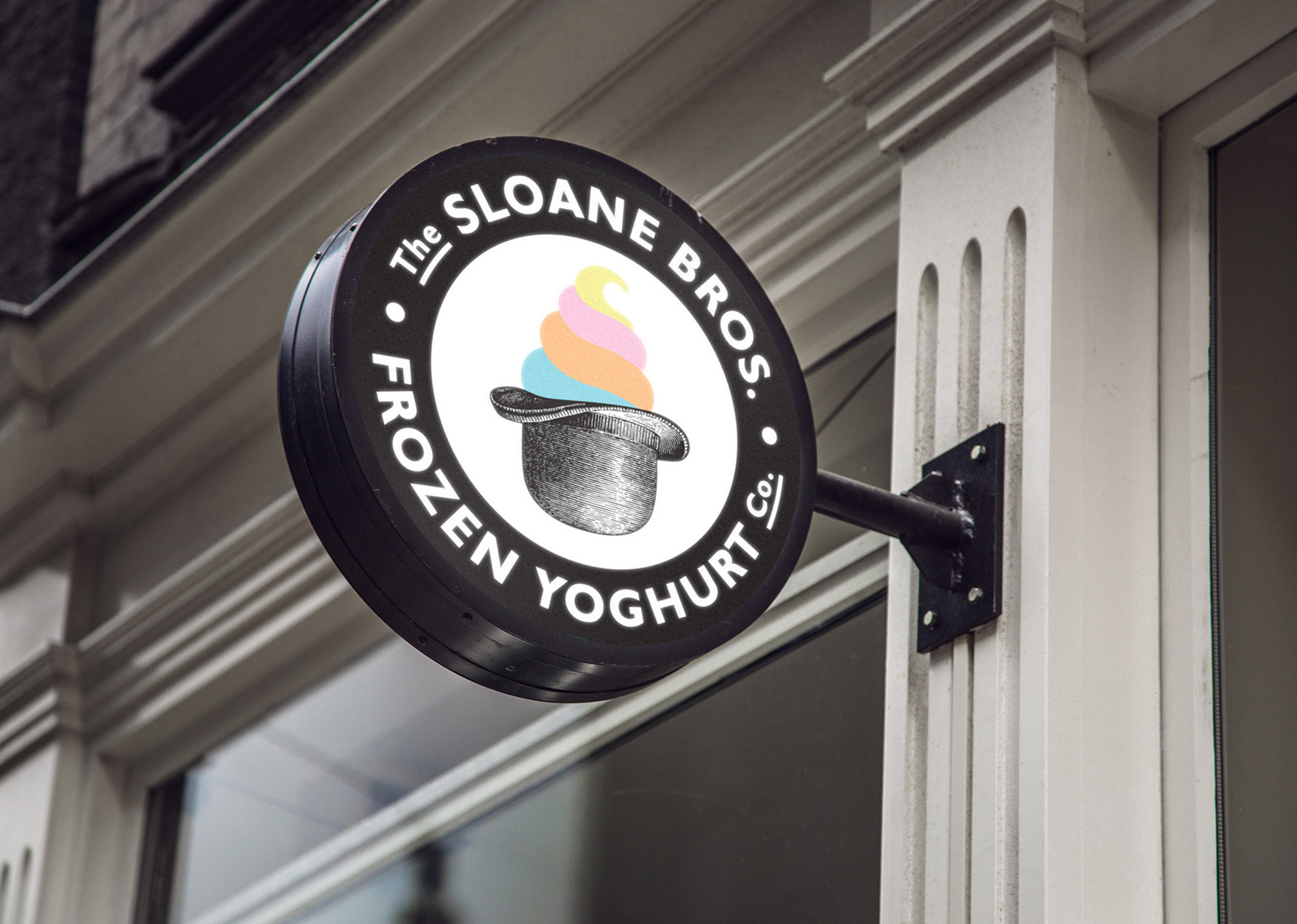
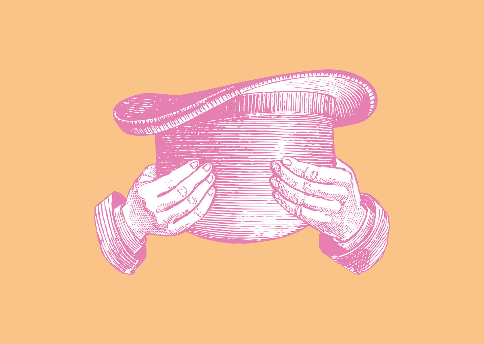
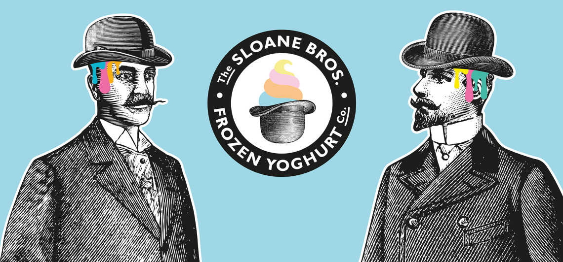
The identity was designed around a bowler hat to reflect the city/East London location and a true British icon.
“A wonderfully fortunate incident involving a batch of yoghurt, a bowler hat and a freak snowstorm, led Walter & Arthur Sloane to create a wonderful concoction right here in East London.”
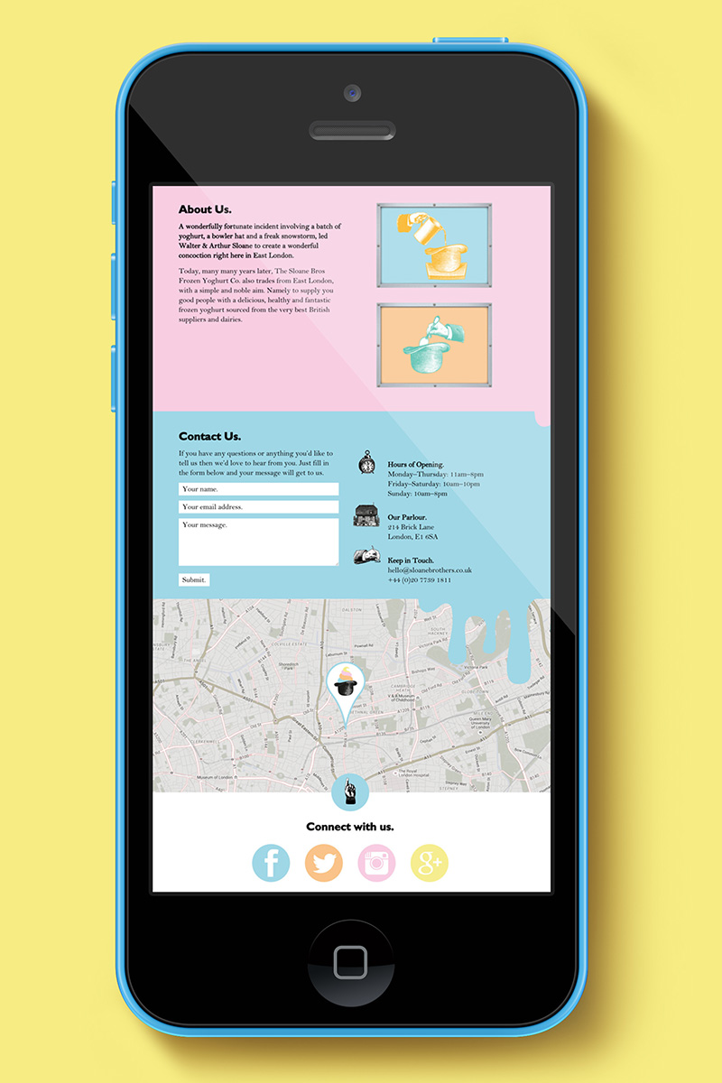
Using the charm and appeal of the two Victorian brothers, Walter and Arthur Sloane as the Master Yoghurteers or “inventors” of this pioneering frozen yoghurt brand, Mystery was able to create the brand’s personality and inform the look and tone of all the graphics, messaging, website and marketing material thereafter.
The brand’s visuals are Victorian in style, but given a colourful and modern twist or treatment. The typography is more 1930s and ‘40s, inspired by old London Underground posters.
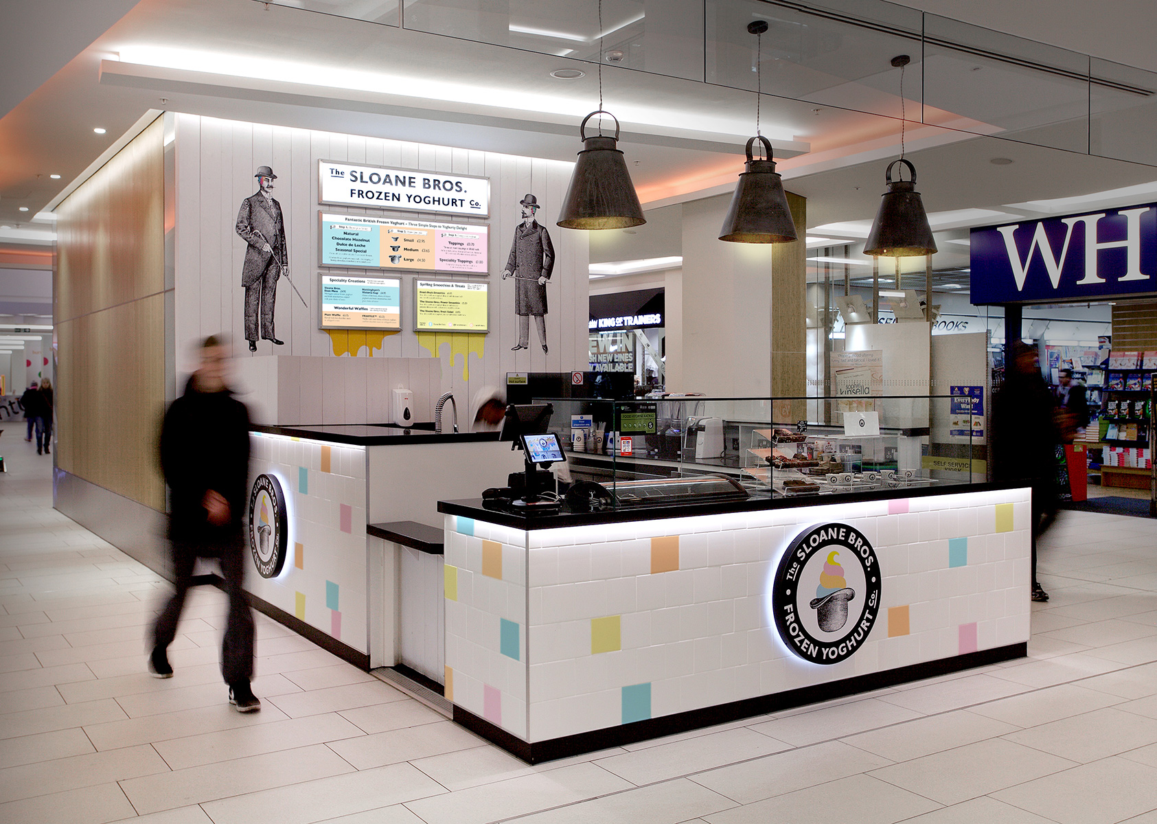
While still in keeping with the original branding and identity, the new kiosks for shopping centre sites have been evolved to stand out in the dynamic, more contemporary surroundings of the modern mall, appealing to a young audience looking for exciting, fresh and healthy treat.
Due to space and 360º visibility, a number of layout challenges had to be overcome: For example, making adequate, hidden storage for ingredients; concealing the necessary, but unattractive kitchen equipment; and safely positioning the hot waffle-makers to avoid any health and safety issues with customers and staff.
In small and busy spaces, operational flow is key, particularly when customers are choosing toppings and sauces. We needed to allow for adequate queuing space after payment and strong menu visibility to assist with the customer's decision-making process. In order to maximise customer gain, we ensured signage was well-positioned and monitored traffic to establish the best orientation for the kiosk.
The original Sloane Bros graphics, colour scheme, wooden cladded wall and tiled counters are all in keeping with the original store, the counters are fresher, brighter and crisper to reflect the modern surroundings.
The Nottingham centre kiosk opened at the end of 2016 to much interest and commercial success. Counters are currently being designed for roll out into other shopping centres over the course of 2017.